Assignment 5: Seven Days
This assignment was the biggest, in my opinion, it allowed a lot of creative control and I will admit it did make me feel a little unfocused to start off with, I had this feeling that I would pick an idea and then think of a better one and I would be going round and round in circles not being able to land on something.
The first thing I did was dive straight into my sketchbook and to previous exercises, this is the final Assignment of Illustration 1 and I wanted to just brush up on the different techniques this course has taught me in lots of different areas, I created quite a few mind maps and took a look back into my previous hand-ins.
When it came down to idea generation I stuck to mind maps and then a spider diagram, for me getting all the ideas down on paper is just the best way, I am a visual thinker but in terms of ideas I find it much easier to write down everything I'm thinking that way I don't miss anything.
One thing that kept going round in my mind was the idea of a Seven Day event, it did control a lot of my ideas, this could be a Food Festival, Film Festival etc. I liked this idea a lot as it would give different subject matters for each day, I wanted to choose a concept that could spark even more creativity.
In the end, I chose a Seven Day food festival but my ideas did not stop there, now I had a foundation idea I started expanding on that, I chose to develop another spider diagram.
I also spent some time doing some visual research, I wanted my food festival to be contemporary and modern, I was inspired a lot by the street food markets in places like Camden. I created a mind map with some visual stimulants. These mind maps help to focus my design work and give me loads of inspiration, I have started to have them up as I'm drawing. I really like the simplicity of the posters I chose, these are designed using 'Swiss Style'. This is a design style I had not heard of but already appreciated, what I did was research deeper into this, I browsed a few blogs and watched a youtube video. I wanted to know more about the elements and the techniques that go into it.
https://www.smashingmagazine.com/2009/07/lessons-from-swiss-style-graphic-design/
I know this is technically graphic design but I'm using it to accompany my illustrations.

I love how abstract and colourful this area of London is, it feels like there is a hustle and bustle, I think it is because everything is incorporated into the environment around, so the buildings become artwork.
Within my mind maps, I said that I wanted to add an element of exploration into my work, I wanted my food festival to celebrate more lesser-known food cultures and cuisines. Upon. the research I found a blog that featured 'Seven' underrated cuisines. I thought this was too much of a coincidence to pass upon.


https://www.foodrepublic.com/2016/09/14/brush-up-on-7-lesser-known-cuisines-from-around-the-world/
I then went onto research into food illustrators and I found an interesting article that went into detail about the profession. They said in the article, the most important thing to ask yourself is 'Why isn't this a photograph' what purpose does using an illustration have here. I want my illustrations to add something to the drawing. I wanted to exaggerate certain aspects in a way that you could not with a photograph. That is why I revisited the visual distortion exercise and subjective drawing. I thought these exercises would be really useful. I also made a list of other exercises to revisit.
https://www.digitalartsonline.co.uk/features/illustration/how-draw-food-20-tips-from-leading-illustrators/#10
This was the link to the article, they highlight other important things to, they said that it should be a celebration of food and bight and vibrant colours work best, I learn through repetition so I made notes.
The next thing I did was produce what I called a proof of concept, I wanted to know if I could produce something stylistic and visually appealing and then start to push the boundaries more.
Using the website about underrated cuisines, I first started with Filipino food, I created an illustration based off a dish called Abodo. I am really happy with how it turned out, I think overall it looks appetising and does actually like the meal it's supposed to be which are things I am happy about, I like using the chalk brushes on procreate but I also want to explore other options. I think it adds a rustic feel but I also want my overall design to be modern and contemporary, At this stage, I think I need to revisit the drawing board a little and come up with some other versions using different styles until I find one that clicks. I just could not see this standing next to the type of visuals I want to create.


I then went and experimented with a more vibrant art style, I thought this would accompany my theme a bit better and provide stronger visuals.

After completing the illustration I feel there is more colour I can add to create this into a more vibrant looking dish I can add the other colour peppers, I also think the chicken needs a little work.
I feel this one looks too 'samey' with this illustration I feel there is work to be done regarding the composition, to make it more abstract.
Overall I think I am happy with how the majority of these illustrations have gone, I feel like some of them don't look as vibrant as others purely because of what I am drawing, for example, the above sandwich is pork which is white meat, I can't really make this pure white as I risk making it look too clinical and fake. Its easier to make food look vibrant when they are already red or yellow or blue for example. What I feel I need to do is really add some contrast on the background and make it pop.
I then went onto experiment with the sticker composition. This is where I could experiment with my Swiss Style design and create something so abstract and impactful, this is why I redrew my illustrations and I am thankful for this development. I feel the research into drawing food really helped me here as it pushed me to think more vibrantly, I was wanting to stick to what has worked in the past with the charcoal pencils (Menu Card exercise) but after consideration, I knew that this would not compliment my design or go with my vision. I am happy I did some experimentation in my eyes it has paid off.
 This was the first composition I came up with, I really liked the pop art element and the abstract shapes however I thought it was all over the place and did not seem contained.
 I then adapted my composition to something that could contain my illustration better, I wanted to further the abstract nature of my design so I played around with the placement of my chicken skewers.
I was really happy with this composition and wanted to then go and create the designs for the others.
Going back to my original mind map I created I was inspired a lot by the abstract shapes and typography, I feel like I have implemented that well into my illustrations.


I feel like the illustration has too much of a painted feel and looks to rustic and that is highlighted when accompanied by the modern typography and design.


I feel like I can draw inanimate objects quite well or at least objects without much proportions to consider, I feel comfortable with drawing things where I have at least some reference. One thing I did during this assignment which I thought was highly successful was the stylisation of my original drawing. I knew I wanted to create something vibrant and colourful and I just went for it. I used the knowledge I had about food illustrations to keep the food appetising.
What did I learn?
For me I thought it was a useful exercise to stylise the drawing, I sat there and looked at the original illustration I did for a proof of concept and just could not see it fitting in.
What could I have done better?
I think perhaps with this exercise I could have researched more into the food more when it came to choosing one for the illustration, for example, the pork sandwich, there was not much of an opportunity to make that vibrant so therefore it was one of the weaker drawings.
EXTENSION: After completing this exercise and evaluating everything I was not happy with how I finished, I did not go into the detail I felt this concept deserved.
I wanted to focus on branding and fleshing out my food festival idea, I watched a TED talk on idea generation and thinking outside of the box this really helped the next step, I focused next getting as many different ideas and thumbnails onto the page, this whole idea of vomiting everything that was in my mind really helped. Here are those sketches.
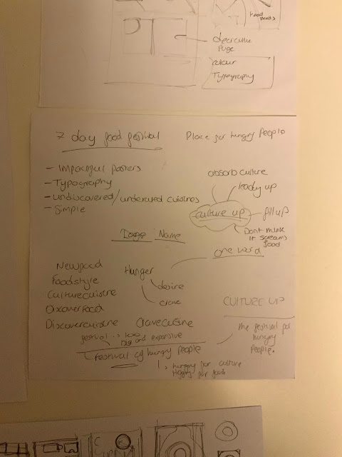


I then went onto designing the branding for my Food Festival, I started with a wordmark, I thought a wordmark would work a lot better than a visual logo because the logo had to the same job as an event title so therefore a wordmark would work would say exactly what my event is. I went with CultureUp as my event name, this played off the phrase, "Soak Up" as in to soak up all the culture. I originally just had that as my event title but then added the word CultureUp but then added the words Food Festival just for clarity.
 The next thing I did was start creating the poster and visual identity. I wanted to create a visual representation of going outside your comfort zone. I decided to play on the idea of how colourful the outside world is and then how plain it is to stay inside your comfort zone (the white circle). The coloured area is created by layering up seven different coloured shapes, this represents the seven underrated cultures. As you can see as well this is just using the word culture up instead of adding Food Festival to the logo.


The first thing I did was dive straight into my sketchbook and to previous exercises, this is the final Assignment of Illustration 1 and I wanted to just brush up on the different techniques this course has taught me in lots of different areas, I created quite a few mind maps and took a look back into my previous hand-ins.
When it came down to idea generation I stuck to mind maps and then a spider diagram, for me getting all the ideas down on paper is just the best way, I am a visual thinker but in terms of ideas I find it much easier to write down everything I'm thinking that way I don't miss anything.
One thing that kept going round in my mind was the idea of a Seven Day event, it did control a lot of my ideas, this could be a Food Festival, Film Festival etc. I liked this idea a lot as it would give different subject matters for each day, I wanted to choose a concept that could spark even more creativity.
In the end, I chose a Seven Day food festival but my ideas did not stop there, now I had a foundation idea I started expanding on that, I chose to develop another spider diagram.
I also spent some time doing some visual research, I wanted my food festival to be contemporary and modern, I was inspired a lot by the street food markets in places like Camden. I created a mind map with some visual stimulants. These mind maps help to focus my design work and give me loads of inspiration, I have started to have them up as I'm drawing. I really like the simplicity of the posters I chose, these are designed using 'Swiss Style'. This is a design style I had not heard of but already appreciated, what I did was research deeper into this, I browsed a few blogs and watched a youtube video. I wanted to know more about the elements and the techniques that go into it.
https://www.smashingmagazine.com/2009/07/lessons-from-swiss-style-graphic-design/
I know this is technically graphic design but I'm using it to accompany my illustrations.

I love how abstract and colourful this area of London is, it feels like there is a hustle and bustle, I think it is because everything is incorporated into the environment around, so the buildings become artwork.
Within my mind maps, I said that I wanted to add an element of exploration into my work, I wanted my food festival to celebrate more lesser-known food cultures and cuisines. Upon. the research I found a blog that featured 'Seven' underrated cuisines. I thought this was too much of a coincidence to pass upon.

Within the above mind map I broke down that things fit into each category, these categories are the skills I have learnt over the course for example methods of Idea generation.

https://www.foodrepublic.com/2016/09/14/brush-up-on-7-lesser-known-cuisines-from-around-the-world/
I then went onto research into food illustrators and I found an interesting article that went into detail about the profession. They said in the article, the most important thing to ask yourself is 'Why isn't this a photograph' what purpose does using an illustration have here. I want my illustrations to add something to the drawing. I wanted to exaggerate certain aspects in a way that you could not with a photograph. That is why I revisited the visual distortion exercise and subjective drawing. I thought these exercises would be really useful. I also made a list of other exercises to revisit.
https://www.digitalartsonline.co.uk/features/illustration/how-draw-food-20-tips-from-leading-illustrators/#10
This was the link to the article, they highlight other important things to, they said that it should be a celebration of food and bight and vibrant colours work best, I learn through repetition so I made notes.
The next thing I did was produce what I called a proof of concept, I wanted to know if I could produce something stylistic and visually appealing and then start to push the boundaries more.
Using the website about underrated cuisines, I first started with Filipino food, I created an illustration based off a dish called Abodo. I am really happy with how it turned out, I think overall it looks appetising and does actually like the meal it's supposed to be which are things I am happy about, I like using the chalk brushes on procreate but I also want to explore other options. I think it adds a rustic feel but I also want my overall design to be modern and contemporary, At this stage, I think I need to revisit the drawing board a little and come up with some other versions using different styles until I find one that clicks. I just could not see this standing next to the type of visuals I want to create.


I then went and experimented with a more vibrant art style, I thought this would accompany my theme a bit better and provide stronger visuals.

Overall I think my redesign was successful, I wasn't too sure about it as I started drawing but I added the shading and it looked less like a slurry of colour. One thing that is hard about producing a vibrant illustration of food is the possibility that it will look disgusting. Colour is so important to appetite, we use colour to tell us if food is gone off or dirty, everything is supposed to look a certain way. What I have tried to do is push it as far as I can, by making the colours of the food brighter and more vibrant, they are simpler shapes and bold highlights and shading, I think it is successful on the basis that I showed this to both my mum and girlfriend that they knew it was chicken and said it looks tasty.
In my opinion, this art style would not be as successful within a restaurant, I am not aiming to do that I am aiming to have them as stickers in a book that you collect so it becomes a fun way of trying new food. That is why I think it works because it is a representation of the food.
All of the following illustrations were created on my Ipad using procreate.
 |
| Kenyan Skewers |
 |
| Ethiopian Injera |
 |
| Grilled Azorean limpets |
 |
| Pork, chilli and pickled onions — a classic in Bolivia |
I then went onto experiment with the sticker composition. This is where I could experiment with my Swiss Style design and create something so abstract and impactful, this is why I redrew my illustrations and I am thankful for this development. I feel the research into drawing food really helped me here as it pushed me to think more vibrantly, I was wanting to stick to what has worked in the past with the charcoal pencils (Menu Card exercise) but after consideration, I knew that this would not compliment my design or go with my vision. I am happy I did some experimentation in my eyes it has paid off.


I was really happy with this composition and wanted to then go and create the designs for the others.
Going back to my original mind map I created I was inspired a lot by the abstract shapes and typography, I feel like I have implemented that well into my illustrations.

I had kind of preempted that my original illustration (whilst it was successful) would not work with the swiss style aesthetic I was going for. What I did was create a mockup using the original illustration and I was right.


What went well?
I feel like I can draw inanimate objects quite well or at least objects without much proportions to consider, I feel comfortable with drawing things where I have at least some reference. One thing I did during this assignment which I thought was highly successful was the stylisation of my original drawing. I knew I wanted to create something vibrant and colourful and I just went for it. I used the knowledge I had about food illustrations to keep the food appetising.
What did I learn?
For me I thought it was a useful exercise to stylise the drawing, I sat there and looked at the original illustration I did for a proof of concept and just could not see it fitting in.
What could I have done better?
I think perhaps with this exercise I could have researched more into the food more when it came to choosing one for the illustration, for example, the pork sandwich, there was not much of an opportunity to make that vibrant so therefore it was one of the weaker drawings.
I wanted to focus on branding and fleshing out my food festival idea, I watched a TED talk on idea generation and thinking outside of the box this really helped the next step, I focused next getting as many different ideas and thumbnails onto the page, this whole idea of vomiting everything that was in my mind really helped. Here are those sketches.


I then went onto designing the branding for my Food Festival, I started with a wordmark, I thought a wordmark would work a lot better than a visual logo because the logo had to the same job as an event title so therefore a wordmark would work would say exactly what my event is. I went with CultureUp as my event name, this played off the phrase, "Soak Up" as in to soak up all the culture. I originally just had that as my event title but then added the word CultureUp but then added the words Food Festival just for clarity.


I then created the mockup of my poster. I was really happy with how it all came together, I feel that the poster looked less rushed and because I had spent the time to create an original and thought out concept instead of just trying to fit the information into an A4 page I think this makes the poster look far more engaging.

 |
| Leaflet sketches |
 |
| Leaflet |
I then created the leaflet for my CultureUp food festival, with the leaflet I wanted to take the visual elements I had already established with my poster as well as the logo and then use this space to add more information such as a small description of the event itself and what it hopes to achieve. I really enjoyed playing around with visual hierarchy with this leaflet and creating something that uses the space well.


Comments
Post a Comment