Exercise Working for Children
Exercise: Working for children
This exercise wants me to first gather examples of imagery for children within different age categories. Remembering the research structure I used for my previous exercises I began first empathising with the age group.
Pre-Reader: I gathered this would be 0-2 years old, within this age group everything needs to be very visual and a heavy focus on imagery. They also need to be easy to understand books in terms of the themes and concepts as they are being read too.
Best books for 2-3 year olds I used this website to do a bit of research into the types of books.
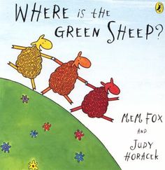


These were the images I collected, I used the website but then also googled books designed for the age group, this allowed me to analyse the images and pull out the factors that make the book fit for that age group. I can then look further into the decision making that lead up to the illustration. First of a lot of the illustrations bend reality, they are not designed to be realistic as they want to spark imagination into the mind of the child. This allows them to be fun and less serious, this is how the child will perceive the world. Something I did not consider as well before the exercise is the use of texture within the illustrations. That can also play into the imagination of the child and push the aspect of multi sensory.
Pre School: Now my initial thought when doing this research is each of these age groups are 'children' but there is specific marketing techniques to each one, they want to be treated their age. The books need to be child friendly and keep them in mind but they don't want to feel patronised or think the book belongs with someone younger. This aspect pushed me further to think more about what sets each book apart and that was a challenge. However I do really enjoy the phycology behind design and how to appeal to different audiences, this is something that really interests me as I have expressed in previous exercises.


One thing I thought that went really well with this exercise was both the final illustration and me analysing the existing covers, I think the thorough analyse helped to establish specific traits, it also pushed me to create my own analyse and have confidence in it.
What did I learn?
I felt this exercise helped to experiment with drawing animals and drawing from reference, I also enjoyed piecing different reference images together to create a final piece.
What could I have done better?
To styalise the image more I could've used some fur texture or experiment with different materials, I opted for a digital illustration look. I could've also collected reference in regards to other scary animals or how other illustrators create scary work.
This exercise wants me to first gather examples of imagery for children within different age categories. Remembering the research structure I used for my previous exercises I began first empathising with the age group.
Pre-Reader: I gathered this would be 0-2 years old, within this age group everything needs to be very visual and a heavy focus on imagery. They also need to be easy to understand books in terms of the themes and concepts as they are being read too.
Best books for 2-3 year olds I used this website to do a bit of research into the types of books.


These were the images I collected, I used the website but then also googled books designed for the age group, this allowed me to analyse the images and pull out the factors that make the book fit for that age group. I can then look further into the decision making that lead up to the illustration. First of a lot of the illustrations bend reality, they are not designed to be realistic as they want to spark imagination into the mind of the child. This allows them to be fun and less serious, this is how the child will perceive the world. Something I did not consider as well before the exercise is the use of texture within the illustrations. That can also play into the imagination of the child and push the aspect of multi sensory.
Pre School: Now my initial thought when doing this research is each of these age groups are 'children' but there is specific marketing techniques to each one, they want to be treated their age. The books need to be child friendly and keep them in mind but they don't want to feel patronised or think the book belongs with someone younger. This aspect pushed me further to think more about what sets each book apart and that was a challenge. However I do really enjoy the phycology behind design and how to appeal to different audiences, this is something that really interests me as I have expressed in previous exercises.


One of the things I wanted to briefly cover because it is not to do with the illustrations but instead about the story, with each audience the story will get longer and more detailed. Now in terms of the illustrations I feel they are bigger, just the way the story begins to get fleshed out the illustration follows suit. They start to take up the whole page and begin to have smaller details within. I also think they have become more stylised to reflect a more mature audience.
Early Reader: This is where children are properly reading books themselves and I feel seek books out themselves, this is where I feel characters are introduced and books tend to have a series and sequals. Now I feel this is where more cartoon images are produced and things start to look like real world. Still in a cartoon stylised way but regards to what I mentioned previously children dont want to feel they are being treated younger than they are.


Established Readers: I would say this is the age group where the illustrations start to verge into mature. They often will include visual metaphors and they are more thought out in terms of composition. I would say overall they are more toned down.


Established readers: This is the peak of maturity for children, this is where children are exploring more genres such as fantasy, regarding the illustration, being visual engaging becomes less of a priority I feel it is all about how it compliments the title and the story of the book.


I then created the two mind maps, I chose the scary and established reader to base my final illustration on. I liked experimenting with a more mature audience in terms of the reader I feel like the scary theme worked better with an older audience for obvious reasons.

In terms of the Hyena I used a couple of reference images. I tried to exaggerate certain features of the Hyena to really push the scary factor. I made the teeth and smile more menacing and vicious.


I don't think the brackets are as clear cut in terms of the age brackets, I feel the biggest thing that changes is the theme of the book and whilst the illustrative style will differ from both ends of the scale, all the ages in the middle do tend to merge together and the lines become blurred. I believe that there is 100% different methods to market to the different brackets of ages and its clearer when you research into it further. The image function changed throughout each age group and I discussed that before, for example with younger audience the function of the image is to excite and stimulate a less developed brain however as you go up through the ages and are dealing with higher functioning brains you can challenge that with visual metaphors and themes of the book.
What went well?
One thing I thought that went really well with this exercise was both the final illustration and me analysing the existing covers, I think the thorough analyse helped to establish specific traits, it also pushed me to create my own analyse and have confidence in it.
What did I learn?
I felt this exercise helped to experiment with drawing animals and drawing from reference, I also enjoyed piecing different reference images together to create a final piece.
What could I have done better?
To styalise the image more I could've used some fur texture or experiment with different materials, I opted for a digital illustration look. I could've also collected reference in regards to other scary animals or how other illustrators create scary work.


Comments
Post a Comment