Exercise: Travel Guides
Exercise: Travel Guides
I used Trello to develop an action plan for this exercise.

To kick this exercise off I found this awesome "Thinking process" for designing, this is something that further helps me with creating structure to my research and design. Each step is key and helps to ensure you are solving a problem efficiently. Overall it was a really valuable tool especially the empathise stage, for this task specifically it helped me to decide on a target audience and consider what they require and how they would respond to my designs.

https://www.youtube.com/watch?v=qyoZTUGzdGY
I then went onto putting that into practice, this was a great exercise to do that in, there was a lot of flexibility within the parameters.
Empathise: The first thing I did was understand the end-user of the travel guide, I wanted to get into their mind and understand the problem.

The end-user in this exercise is Travel Fanatics, well this was kind of decided by me I could've gone a few different routes, for example, a new traveller or family holidaymakers. However, I felt the Countries I had to create the tour guides to fit the 'Travel Fanatics' end user.
After watching a series on youtube by 'The Futur' called 'Building a Brand' they explore different characters they want to market too, they have the main consumer in mind but they also want to make sure their final brand is appealing to a few other users. They do this so they can create an overall aesthetic but they don't want it to lean more towards one specific consumer. I kind of did the same process, I had the 'Travel Fanatic' in mind but then made sure I would also appeal to the Family Holidaymaker to an extent as well as the New Traveller. I feel overall the initial mindmap I created uses words that will appeal to these other audiences as well.
I feel like this empathize phase is very much just brainstorming but one thing I took away from the video podcast as that I should focus more on the end-user and try and get more into their head. There is a massive rise in young people going travelling and they are wanting to spend their disposable income on experiences and travel, I set that age group as my Travel Fanatics. I began to think deeper into what they would expect from a travel guide.
From my mind map I then created myself a bit of a brief, this ties into the define phases where I am creating a plan to solve the creative problem. I wrote. 'Young People want to feel like they're in safe hands and being looked after. The design overall needs to envoke a sense of safety. It also in doing so needs to be trendy and modern, this plays into the rise in young people travelling and the destinations they visit. Instagram and photography are a massive component so the travel guides need to highlight the culture/sights and places to visit'
http://www.kaleyann.com/modern-travel-guides/
I found a website that displayed lots of really interesting existing travel guides from a range of publishers and artists


I continued that with Milan and Istanbul, sketching out some small details. I found this process useful as I find it more effective to have my ideas written down as I am renowned for forgetting things.
From this point what I then decided was that I wanted each illustration to capture the very nature of the city, I used my mind mapping to single out 3 key factors, 1 from each city.
Helsinki: Modern and Contemporary
Istanbul: Colourful and Rich
Milan: Prestigious and Elegant
I kept these points in mind and went to make a series of mindmaps.
Each mindmap I found images that would serve as a great reference for design, I found it helpful to have those adjectives as a driving force for selection. It helped me to narrow down my picks and collate a more effective mind map. For example with Helsinki I focussed on the modern architecture, I love the shapes and abstract nature of their buildings. For Istanbul, I delved deeper into the Bazaars and the and bustle of city, it is so rich in colour and vibrancy. Milan I researched into the La Scala Milan. I used this website https://www.askthemonsters.com/la-scala-ballet-school-milano/. It displayed some never before seen images and showed me a gold mine of elegance and culture. I also focused on the grandeur of Milan and the gothic buildings, I specifically liked the image in the top right, I thought composition wise this was fantastic, it was an overview of the city framed in an archway.
I then created 3 more mindmaps, this time on how I was going to achieve this visually.


I thought within this exercise my composition went well, I feel like I used the composition as a tool to further emphasise the personality of the city, I have never really considered composition as much but feel it really benefitted me within this exercise.
What did I learn?
This exercise taught me to consider the end user more and to put emphasise on how they feel / will respond to the design.
What could I have done better?
I feel like I could've spent more time considering the colours I was going to use before jumping into illustrating.
I used Trello to develop an action plan for this exercise.

To kick this exercise off I found this awesome "Thinking process" for designing, this is something that further helps me with creating structure to my research and design. Each step is key and helps to ensure you are solving a problem efficiently. Overall it was a really valuable tool especially the empathise stage, for this task specifically it helped me to decide on a target audience and consider what they require and how they would respond to my designs.

https://www.youtube.com/watch?v=qyoZTUGzdGY
I then went onto putting that into practice, this was a great exercise to do that in, there was a lot of flexibility within the parameters.
Empathise: The first thing I did was understand the end-user of the travel guide, I wanted to get into their mind and understand the problem.

The end-user in this exercise is Travel Fanatics, well this was kind of decided by me I could've gone a few different routes, for example, a new traveller or family holidaymakers. However, I felt the Countries I had to create the tour guides to fit the 'Travel Fanatics' end user.
After watching a series on youtube by 'The Futur' called 'Building a Brand' they explore different characters they want to market too, they have the main consumer in mind but they also want to make sure their final brand is appealing to a few other users. They do this so they can create an overall aesthetic but they don't want it to lean more towards one specific consumer. I kind of did the same process, I had the 'Travel Fanatic' in mind but then made sure I would also appeal to the Family Holidaymaker to an extent as well as the New Traveller. I feel overall the initial mindmap I created uses words that will appeal to these other audiences as well.
I feel like this empathize phase is very much just brainstorming but one thing I took away from the video podcast as that I should focus more on the end-user and try and get more into their head. There is a massive rise in young people going travelling and they are wanting to spend their disposable income on experiences and travel, I set that age group as my Travel Fanatics. I began to think deeper into what they would expect from a travel guide.
From my mind map I then created myself a bit of a brief, this ties into the define phases where I am creating a plan to solve the creative problem. I wrote. 'Young People want to feel like they're in safe hands and being looked after. The design overall needs to envoke a sense of safety. It also in doing so needs to be trendy and modern, this plays into the rise in young people travelling and the destinations they visit. Instagram and photography are a massive component so the travel guides need to highlight the culture/sights and places to visit'
http://www.kaleyann.com/modern-travel-guides/
I found a website that displayed lots of really interesting existing travel guides from a range of publishers and artists

This is the set of books that inspired me the most, I really liked the simplicity and focus on the illustrations in the middle, all of them look uniform and presentable, you can tell this is a complete set.

One thing I love about this set, and it's a small thing, is the fact that each book is cohesive and feel very put together. You can tell by the style each one is from the same set.
 |
| Individual country research |
What I then went and did is take some time to research deeper into each country and find more about them, I looked for landmarks and general details. Helsinki, for example, wants to be the most viable city, It wants to lead in innovation and technology and be carbon neutral by 2025. Overall the aesthetic of Helsinki is modern and highly contemporary.
 |
| Individual country research |
Helsinki: Modern and Contemporary
Istanbul: Colourful and Rich
Milan: Prestigious and Elegant
I kept these points in mind and went to make a series of mindmaps.
 |
| Istanbul Mindmap |
 |
| Helsinki Mind Map |
 |
| Milan Mindmap |
I then created 3 more mindmaps, this time on how I was going to achieve this visually.

For Milan I researched into what makes a design elegant, I found a great blog that was reviewing some particularly elegant pieces of art.
https://www.digitalartsonline.co.uk/features/illustration/celebrate-summer-with-these-stylish-elegant-illustrations/#6

With Helsinki I kind of already had this decided, because overall my art style was going to be abstract and contemporary, it would fit into Helsinki well however I especially want to exaggerate the intense neon colours and abstract nature, I could push this further my distorting the buildings and changing the colours.
For Istanbul, I wanted to make this the densest of the illustrations to really exaggerate the Bazaars and how colourfull they are.
I then completed some reference sketching for each city, I took the imagery I collected from my mindmaps and made some abstract versions, for example with the ballet dancers I really experimented with shapes.
 |
| Milan Reference sketches |
 |
| Istanbul reference sketching |
 |
| Helsinki reference sketching |
I then went into procreate to illustrate, I used my sketches asreferencee and photographed them into the software. I experimented this time with not create my usual black outline I instead opted to piece everything together with blocks of colour. I feel this leans further towards the abstract reference I gathered. Overall I feel each piece is successful, I enjoyed playing around with the composition of the illustration as the exercises wanted it to be diagrammatic, I did try and implement this style, I wanted each piece to feel like a collection of culture whilst still maintaining a distinct style and composition.


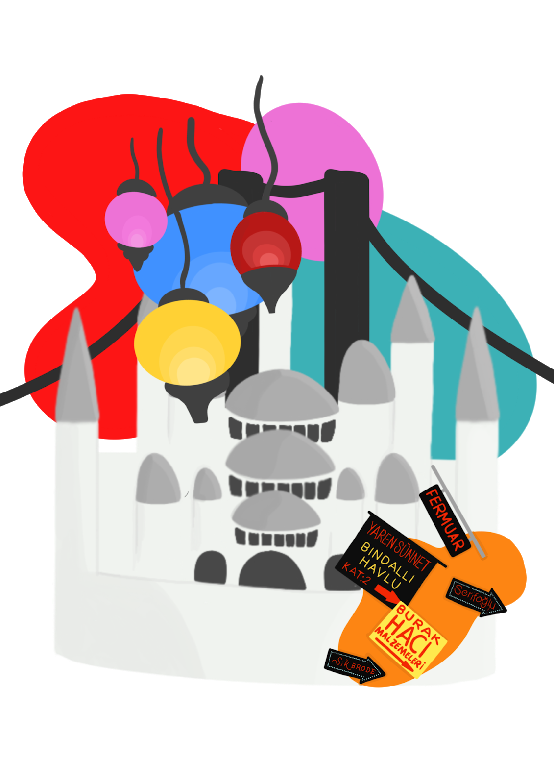

Here a my 3 final illustrations, I know I was only asked to produce a mockup for 3 but I wanted to produce 3 final illustrations as I was really enjoying the exercise. The one I am the least happy with is the Istanbul one particularly with the signs, I dont think they sit right on the orange blob, I am planning on re working that slightly upon reflection.
After some consideration I decided that I wanted to make some further adjustments to each illustration, specifically the Milan and Istanbul. Regarding the Milan illustration I decided that it was too flat, it didnt have the same level of flare and elegance as my reference. I analysed the image and decided what was missing and what to experiment with. The image didnt have any of the grain and texture which I liked I also thought I could work on the lighting, within my research I noted down how I like the 'delicate hints of light' yet none existed in my illustraiton. I took it into photoshop and touched it up.

In photoshop I created some more contrast between the pillars and the actual scene, I did this by darkening the pillars with shadows and then adding a big blast of light into the middle, I also added some grain to the image. Overall I like the changes I made I think it furthers the elegance of the image by adding some texture and highlights.
I then went onto mockup the final Milan image and see how it would fit into an actual book. I played around with the font for Milan as well, I wanted it to be elegant and stylish that is why I went with a caligraphy font but one that was not too delicate as it is also quite a gothic city with bold features.

What went well?
I thought within this exercise my composition went well, I feel like I used the composition as a tool to further emphasise the personality of the city, I have never really considered composition as much but feel it really benefitted me within this exercise.
What did I learn?
This exercise taught me to consider the end user more and to put emphasise on how they feel / will respond to the design.
What could I have done better?
I feel like I could've spent more time considering the colours I was going to use before jumping into illustrating.


Comments
Post a Comment