Exercise: Editorial Illustration
Exercise: Editorial Illustration
I started by creating an action plan through Trello.

This exercise tasked me firstly to buy a newspaper and analyse the illustrations, I chose to go down a different route, I found a website that follows the work of Maria Fabrizio.


I really loved the message and the process behind this exercise I think it was a really powerful topic I have adapted well and have used the research I conducted to help influence my final piece. I also feel my actual illustrations look great and I am really happy with them. I feel I have started to develop a style and using reference from other illustrators and real-life can be more comfortable at drawing.
What did I learn?
This exercise taught me to adapt to my own personal levels and artistic skills, It was a standout phrase in the exercise that said to be honest with your own skill and design an illustration to accompany that. I wanted to include some humans into the illustration but that is my weakest skill and I just do not like drawing humans, however, I get in this mindset that I always need to push myself and whilst that is true I need to recognise the skills needed to be successful at illustrating humans and if I want to deliver something good I need to put the time in to learn. So expecting myself to just draw will not only demotivate me when it doesn't turn out how I wanted it but also create a piece I'm not happy with. I feel I have been true to myself and happy with the results.
What could I have done better?
I am ultimately really happy with my approach to this exercise and the final piece. I don't really have much that I feel I could improve on, I would say the illustration of the fish is pretty basic and could do with so more details to the same level as the turtle.
I started by creating an action plan through Trello.

This exercise tasked me firstly to buy a newspaper and analyse the illustrations, I chose to go down a different route, I found a website that follows the work of Maria Fabrizio.
https://mymodernmet.com/editorial-illustration-wordless-news/
She produces Editorial Illustrations based on real-world headlines. I thought this would be more focussed and allow some deeper analyses.
I saved a few of her illustrations and read briefly through the article that went with it. Her illustrations are super creative and I feel have inspired me a lot more than reading my local newspaper.
While Fighting The Odds, Fiona The Hippo Became A Social Media Star

Fiona the hippo was catapulted into social media stardom from the day she arrived on the planet.
The baby hippopotamus was born at the Cincinnati Zoo earlier this year. At the time, she was six weeks premature and weighed only 29 pounds. While that might sound like a lot, most baby hippos weigh between 55 and 120 pounds at birth.
Zookeepers were expecting her to arrive in March, so when she came into the world in January, they weren't sure she would make it. She received 24-hour attention from zoo staff and her health even became a citywide effort when workers from Cincinnati Children's Hospital Medical center helped put an IV in Fiona when she experienced dehydration.
This is the first illustration. The original article was all to do with the Cincinnati Zoo. Their new baby hippo has become a social media star. I feel this is both decorative an informational. There is not much of a metaphor present it instead shows the cloud of likes and support around the hippo. When I closely analysed it though I thought maybe it could represent the effect of social media attention on the brain as the hippo looks very happy and content.

I would say this illustration is more conceptual. The original article was about if 'Anti Snoring tools, really work' I love how she has captured the idea of snoring, this is almost from the 'Victims' perspective, they perceive this as a literal storm of thunder. Storms usually keep people awake and are loud, which is a visual metaphor for Snoring. Also, you can tell the person snoring is completely oblivious to the storm he is creating.

This is my favourite out of all the articles, I feel it has a small tie in with the assignment from unit 4. I am currently obsessed with improving my mental well being and this article is all about how green space can affect the mind and your mood. This illustration uses negative space to create the head of a woman, it shows the freedom in her mind how the only thing filling her head is nature. She also visually looks happy and stress free.

This is the last illustration I viewed. This article talks about how when Dinasours walked the Earth, mammals took to the skies. We quite literally had flying Squirrels. This is a very literal and decorative illustration, I feel the focus is more on the cuteness on the animals, I myself would've gone in this direction as it represents the article best.
The next step in the exercise was to choose one of the headlines, the one I chose was
"How Green is your food" I enticed me because I'm really passionate about leading a greener more environmentally friendly life, especially when it comes to food.
When was the last time you looked at how much plastic was used to package your food?, have you ever considered the carbon footprint of Spanish Strawberries? Every year 270,000 tonnes of plastic are used in the UK on a smaller scale on average each UK household throws away 40kg of plastic each year.
When was the last time you looked at how much plastic was used to package your food?, have you ever considered the carbon footprint of Spanish Strawberries? Every year 270,000 tonnes of plastic are used in the UK on a smaller scale on average each UK household throws away 40kg of plastic each year.
The next thing I did was highlight the text, I highlighted what were, in my opinion, the most important aspects of the text, I chose the obvious ones, I feel the text is largely focussed on plastic packaging and carbon footprint, however, I also highlighted the word considered. Considering the headline of the article, "How green is your food?" I feel it is very focussed on being mindful. It is asking a big question and wanting to envoke a specific thought in the reader's mind, because of how massive the impact of the article subject is, I wanted to put a focus on self-evaluation as that is the desired effect.
I took a chunk of time to really research into this subject and other illustrations out there. I feel this form of activism is an area of design I have always expressed interest in. One thing I really loved about a few of these illustrations is the contrast, they have managed to create a very defined split. It is helped by the physical split of sky and ocean but they have used this really creatively to show the destruction happening under the sea. Particularly in these two pieces.

This second illustration also does the same thing as the first one and that is to create this stark contrast and this does it so powerfully. This illustration demonstrates how plastic has destroyed this whales life, they are consumed by it. Quite literally the plastic is a part of them and has ripped them in half, it could also reflect habitat loss as well as plastic pollutes and destroys their natural environment.
The next thing I did was to write down a few words I wanted to describe my illustration.
- Impactful
- Constrast of our world to the future
- Dirty
- Wasteful
- Hopeless
I then went onto sketch out some ideas or my illustration whilst reading through the article, this was an interesting process for me and helped me to not only develop ideas but also refine them as well. I struggle slightly with initial ideas for me idea generation is difficult, I have a very vague 'big idea' in my mind and I struggle to translate that to paper, I feel like everything I sketch out has to be this 'big idea' but really I need to slow down and relax, the earlier process of sketching helps me to work up to that idea. I need to nail the early process of idea development, that is what i'm going to be foccusing on more, ways of giving myself a libary of mind maps and sketches and idea exploration before thinking about final concepts. When I initially started sketching I was trying to sketch out thumbnails of complete ideas without the foundations.


I then went onto creating the line visual for my illustration, from my sketches I had refined my final idea and created it into something that I was super happy with, I then created a catchy and impactful statement to accompany the illustration.

I then went onto designing a colour pallette for my illustration, I had two focussess, 'under the sea' and 'above the sea'. I visited adobe colour to pick out some colour palettes. I really liked these pastel colours. Adobe colour is really great because you can search for actual images and then it will find colour palettes created from those images.
From a glance I feel like all the colours compliment each other nicely, they are all qutie muted toned down colours so what I did was combine the palettes together, I took each palette into photoshop and cut out the parts, I fixed them all back together and got rid of some of the colours that I didnt think quite fit, it helped to streamline both palettes and get rid of colours I did not need.

 |
| MindMap |

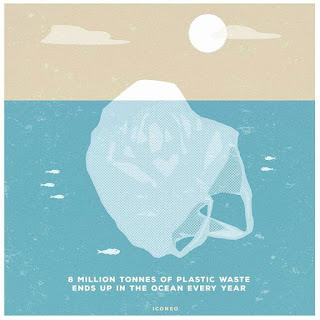
This particular illustration from Steffen Kraft really highlights the sheer extent of the plastic consumption with this really creative iceberg illustration. Icebergs are so deadly because they can look harmless from the surface but underneath is where the true destruction lies, I feel like this is the perfect metaphor as the plastic fills the ocean and often we can't see it all, furthermore the iceberg could represent our naivety, we throw away our plastic in the bin and then we never see it again it is then disposed of elsewhere where we never see it again, we live our normal lives unknowingly destroying the planet.

This second illustration also does the same thing as the first one and that is to create this stark contrast and this does it so powerfully. This illustration demonstrates how plastic has destroyed this whales life, they are consumed by it. Quite literally the plastic is a part of them and has ripped them in half, it could also reflect habitat loss as well as plastic pollutes and destroys their natural environment.
The next thing I did was to write down a few words I wanted to describe my illustration.
- Impactful
- Constrast of our world to the future
- Dirty
- Wasteful
- Hopeless
I then went onto sketch out some ideas or my illustration whilst reading through the article, this was an interesting process for me and helped me to not only develop ideas but also refine them as well. I struggle slightly with initial ideas for me idea generation is difficult, I have a very vague 'big idea' in my mind and I struggle to translate that to paper, I feel like everything I sketch out has to be this 'big idea' but really I need to slow down and relax, the earlier process of sketching helps me to work up to that idea. I need to nail the early process of idea development, that is what i'm going to be foccusing on more, ways of giving myself a libary of mind maps and sketches and idea exploration before thinking about final concepts. When I initially started sketching I was trying to sketch out thumbnails of complete ideas without the foundations.

I started out with a mindmap of images and words, this was originally just based around the idea of 'how green is your food'. I sketched out some ideas quite loosely, it was all about getting it all on paper and my idea out visually. I do feel I am developing a skill at marketing and I like to create pun's and tie statements and observations about the world into creative illustrations. Like for example, I wanted to create an illustration to tie into the article, I wrote 'Have you ever considered the carbon footprint of Spanish strawberries. I sketched out the side view of a plane with thick black clouds of smoke billowing out and then a strawberry in the window saying 'WOW, England'. This has been a common trend with my illustrations and this process helped lead to my final piece because I kept building on the idea.
I started to create a focus, it was really helpful as it locked down a particular area, I focussed on waste. Specifically, the plastic waste that comes as a result of food packaging

On the next page, I began to explore small thumbnails, I'm glad I used the visual mindmap and the early sketching before to help shape and define the thumbnails. It helped to give myself a focus, I explored different thumbnails centred around "Plastic is taking over" I thought it was quite funny to have a plastic bottle overlooking a city with laser eyes (2), just to really take the metaphor to the max. However, I decided that it would be too comical and it wouldn't fit with the words I had decided I wanted to describe my illustration. I chose to go with a more grounded approach, I ended up creating the line "We wouldn't want our world filled with plastic so why do we fill theirs"
The following thumbnails are influenced heavy by my research, I take on this idea of contrast and use the transition from sky to water to show the difference between our world 'their' world. Their being all the fishes.
I then went onto creating the line visual for my illustration, from my sketches I had refined my final idea and created it into something that I was super happy with, I then created a catchy and impactful statement to accompany the illustration.

I then went onto designing a colour pallette for my illustration, I had two focussess, 'under the sea' and 'above the sea'. I visited adobe colour to pick out some colour palettes. I really liked these pastel colours. Adobe colour is really great because you can search for actual images and then it will find colour palettes created from those images.
 |
| Under the sea |
 |
| Sky |

 |
| Final Piece |
What went well?
I really loved the message and the process behind this exercise I think it was a really powerful topic I have adapted well and have used the research I conducted to help influence my final piece. I also feel my actual illustrations look great and I am really happy with them. I feel I have started to develop a style and using reference from other illustrators and real-life can be more comfortable at drawing.
What did I learn?
This exercise taught me to adapt to my own personal levels and artistic skills, It was a standout phrase in the exercise that said to be honest with your own skill and design an illustration to accompany that. I wanted to include some humans into the illustration but that is my weakest skill and I just do not like drawing humans, however, I get in this mindset that I always need to push myself and whilst that is true I need to recognise the skills needed to be successful at illustrating humans and if I want to deliver something good I need to put the time in to learn. So expecting myself to just draw will not only demotivate me when it doesn't turn out how I wanted it but also create a piece I'm not happy with. I feel I have been true to myself and happy with the results.
What could I have done better?
I am ultimately really happy with my approach to this exercise and the final piece. I don't really have much that I feel I could improve on, I would say the illustration of the fish is pretty basic and could do with so more details to the same level as the turtle.


Comments
Post a Comment