Exercise: Childrens Book Cover
This exercise wants me to produce an illustration for a new educational book called Animals around the world.
To begin the exercise off I started reading some blog posts about book cover design.
https://www.designhill.com/design-blog/evolution-of-book-cover-design/
The first blog post centred around the evolution of book cover design and how it has changed over time to fit the tastes of the era, one thing I got from the post was that you should embrace the trends of the era. If you are trying to get your book to be seen on the shelves you have to make it visually interesting and pop.
This was the list of 2019 trends, what I did was gather some reference images surrounding each new trend. I then added them to my brainstorm which I then built on further.

 |
| Big Book Design |


These two images have more to do with the colour palette, orange and yellow is a new trend, the blog describes the colour palette as "It catches the eye like nothing else" Even if I do not go with this particular colour palette, it is important to note down how vital a good colour palette is for a cover, you want to avoid it being too overcrowded with colour and not have a flow.


This trend I found really interesting because I see this a hell of a lot within book covers and within general design such as posters. It involves having big bold text placed on the cover and then an image covering up part of the letters, it aims to create depth. When I first saw this I did envision having animals surrounding the text.

This trend involves having found items such as plane tickets or newspaper cutouts on the cover. Whilst I think it is effective, it was one of the trends I looked at and didn't really have a use for, it does not strike me as child-friendly and the uses I have seen of it, it feels like it's more appropriate
within the thriller genre.
I have already established I want my illustrations to avoid looking like the image below, I think this over cartoon effect Is in my opinion dated as well.

I want to have my animals stylized and textured, I think that is definitely what a modern audience would look for just like the exercise wants. Especially with the current trends in children's books, watercolour and pastel art dominate.


I then took to my sketchbook to do a little bit of brainstorming, I wanted to get some ideas down that highlighted my direction, what I wanted to achieve and also what I had already established I wanted to avoid.
The first thing I looked into was what some of the current educational children booked looked like, from my days at school I remember them being very plain and corporate.

Right of the bat you can just tell this selection of books are educational, they usually feature gradient backgrounds, a big title and then some photography. These are the types of books I remember. I feel this aesthetic for books are quite dated. I also want to make the learning experience fun and playful with the book cover I produce, that was the first thing I noted down, I wanted to branch away and be more modern.

Now this book cover does play into some of the trends, it does introduce some illustrations and characters, I still think it feels bare and plain though with the background and how the characters are just placed on top of it.


Now this book cover does begin to introduce some texture and a better colour palette. However, it is just a personal issue but I feel like this book cover still has smaller illustrations just placed onto coloured backgrounds, and personally, this just doesn't just appear cohesive. It does not feel like the illustration is the main focus this is why I am going to be doing that with my cover.

Me and my girlfriend are still on holiday at the moment so we headed out into town, on the way we did stumble across a book store.

Within the book store, I found a lot of great covers for children's books, I had already done my initial research so I searched for books with the look and feel I wanted to have.


I think here it takes it up a level, the illustrations still feel very friendly however I think with this drawing it is the style that really shines, the big rounded eyes and the simple anatomy. I think it is all about taking real life and putting it through the lens of a child.

This was just an example of a Czech illustration. I like the texture and colours of this.
What I then went on to do is start sketching out some thumbnail sketches, I started out with a very basic idea just to get the ball rolling, I used the research I had completed before to establish a big bold title that filled a large amount of the page. It is followed by an illustration of the Earth itself. I then built on that by adding some of the animals, I had the idea of them creating a circle with the earth inside of them, this would have them literally around the Earth. I kept thinking in my head, how can I build on this, I wanted to really develop my ideas until I felt that they were in a good place, I often do not spend time doing this as thoroughly as I should. I often jump from idea to idea.
The idea I was really happy with was to tie in the front and back cover, I would have the animals walking on top of the Earth on the front cover and then on the back have them walking on the bottom so it continues around.
I did then want to add an educational element to the cover, I felt that is what it was lacking, adding the flags would be more suitable. I feel the way I have developed my ideas here on this first page has really helped me explore.
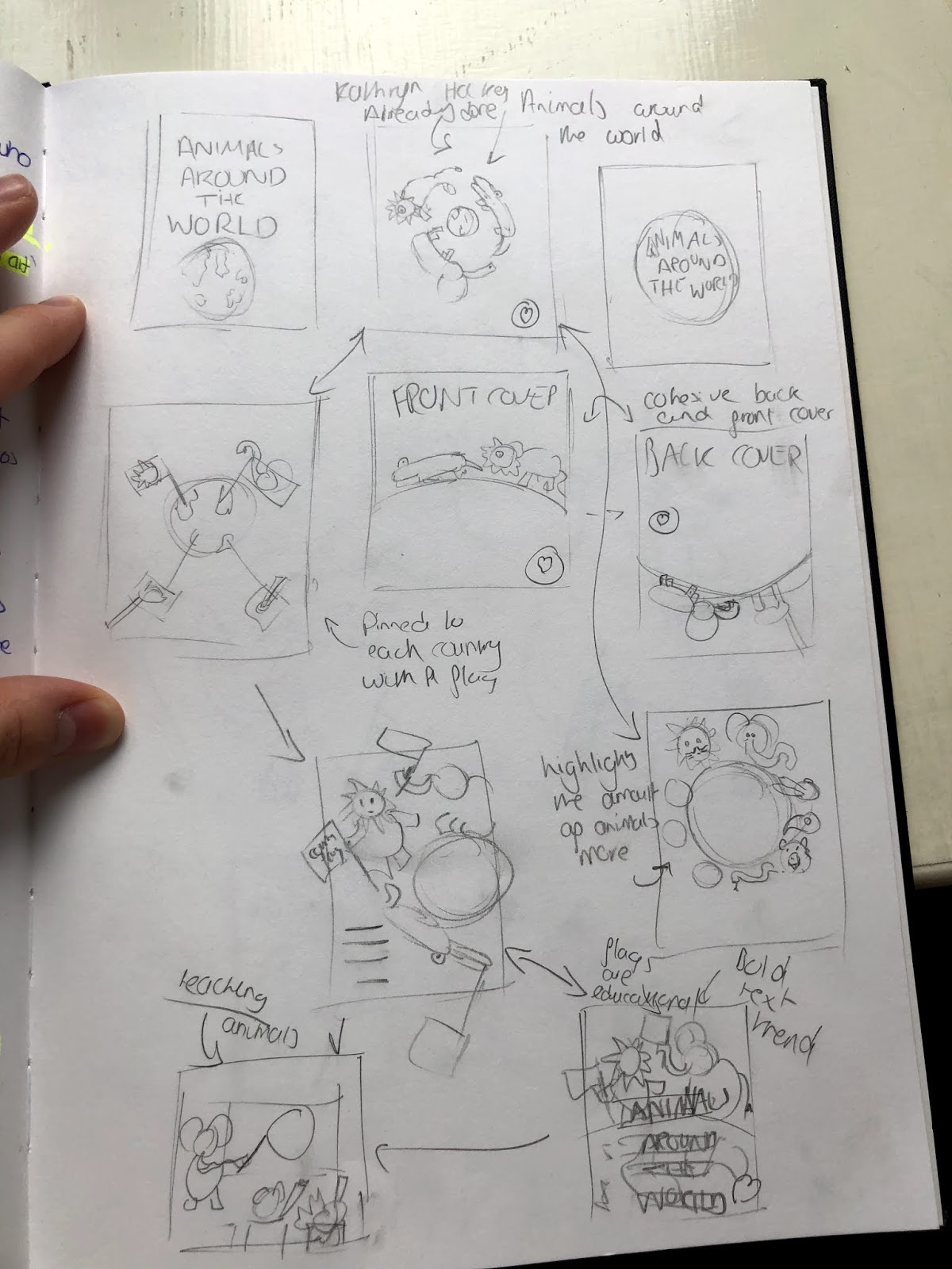
What I then went on to do was explore actually creating a scene, from the research I conducted both physically and on the internet, I noticed a huge trend was creating a full scene and then having a space for the text to fit in. I think this direction adds to the sence of escapism and world building. I tried experimenting with that idea. I had the idea of having a classroom with animals sat down learning about Animals around the world. I developed this idea a couple of times and built on the original concept, but I ultimatley did not end up going for it, I did not feel it brought that idea of it being an educational book, I feel it felt too much like a story book as it embraced a trend entirley.
This was also where I came up with one of my final ideas, I wanted to combine the idea of a whole world of animals and this endless exploration. I had an idea to have these toys that you can rotate and create different animals, with the head of a Zebra and the body of a Lion. I think this idea was really successful and I could not wait to produce a client visual for it and get it developed further in colour.

Before I started creating my coloured client visuals, I went back to the exercise just to give myself a refresher on what they are.


What went well?
I think this was a successful exercise, I tried to take the level of research I conducted on the previous exercise and streamline it. I feel this really did help give me an artistic direction. I was also really happy with the diverse ideas I came up with, I always get motivated when I come up with what I feel is a unique idea and then that then generates more sparks and ideas.
What did I learn?
I think a big thing I took away from this exercise going forward was to delve into the current trends of that area, I often feel that I'm nervous to use trends as I feel it is a cop-out and you are not creating your own ideas. However I started to adapt those trends, I wasn't just copying them, but making them work for me.
What could I have done better?
After I had finalised my ideas, I then went to produce my client visuals, It then struck me that I did not know how to really draw the animals, I had drawn an incredibly rough sketch for the animals when I draw my thumbnails, but when I tried to add more detail I had to then google the anatomy of the animals. Whilst this helped me to produce my illustrations I could've done this earlier to make it easier.
http://nataliemerheb.com/illustration-101/top-tips-for-good-childrens-picture-book-cover-design/


Comments
Post a Comment