Exercise: Objective and subjective drawings
Exercise: Objective and subjective drawings
For these next exercise I had to draw something objectively. Researching into objective drawing and what it was I instantly knew it would be out of my comfort zone. Whenever I have drawn anything, the finer details I feel have been missed. If I'm drawing something from real life and some details don't quite line up, or an element is closer than it should I would just dust over it and continue. Ultimately at the end what I had drawn would look fine but it did lack finer details. This has a lot to do with my patience levels and often I would get frustrated. Doing this exercise pushed my patience and at times I just wanted to leave it and move on but I kept at it and forced my self to resist the easy route. I have to say though, I could not have done this without my eraser.
I chose to draw my Fossil Hybrid watch, it is round and has a lot of smaller details within the face. I positioned the watch on top of my white diary, I thought this would be the best background for the watch and would add contrast for my drawing, I didn't test it with any other background but I presume it worked well.


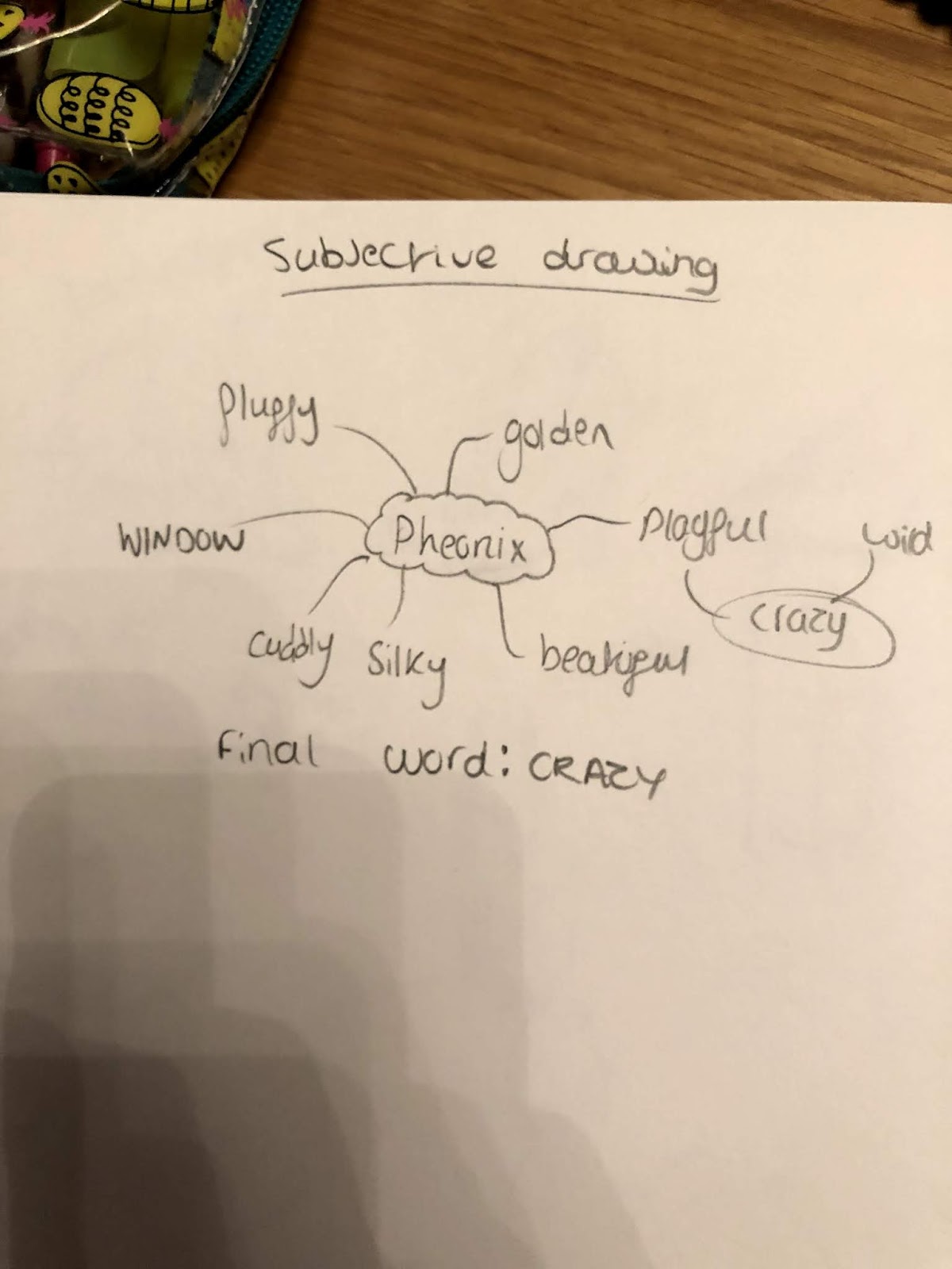
Out of all the words on this list I thought that 'Crazy' would be one of the most difficult for me to capture. I knew this because it was the one word I had the least ideas for originally. However once I really started to delve into it, there is so many possibilities.
I then began to research imagery for my moodboard, I don't own very many magazines or things to cut out so I just used google and photoshop to produce my moodboard as in my opinion this is just as beneficial to me as a physical moodboard. Before I started googling I created a list of outlets of the word 'Crazy' to explore. I wanted to dig deeper into the word, as a dog Phoenix is crazy, but that doesn't mean he is a serial killer or on drugs, in his context he is full of energy and jumps around everywhere, his brain is also going so fast he is often all over the place. I chose to focus on those aspects as well.

What I then did create a light sketch on my watercolour paper. I didn't want to then go an ink it but instead use the pencil sketch as a light guide to drawing it. I wanted to include elements of the crazy and abstract art that I had put into my mood board. I used the patchwork to create the nose and then I thought the ears where the perfect platform to create an abstract 'starry night' look.

One thing I wanted to highlight was the rolls on Pheonix's face they aren't as prominent on the photo but I thought this would add to the overall image and how crazy he is. To outline the ears I used the same effect as 'energy' photo. I really liked these crazy jagged lines in all different shades of red and yellow and does further the crazy nature as well. I think everything I'm doing is to further that overall look.

Overall It took about 3 layers of pastel, I started with one layer of light orange and then used a layer of hairspray and then added some darker shading and then another layer of setting spray and so on. I really wanted to try and get as much colour into it because I was trying to make the features more defined and didnt want it to look muddy and inconcivable. Now from reviews of my work a lot of people I have asked such as my girfriend and brother say that it does not instantly look like a dog, I think because I have been looking at it for so long that it does and I can see the resembalance to the picture. I think because I began with such a wierd image ( to help drive the subjectiveness ) that already it didnt look much like a dog, then I drew it all crazy. I am happy with the amount of elements I managed to fit into the illustration, I think overall it has a wacky and crazy nature with lots of experimentation inside, which I enjoyed.

For these next exercise I had to draw something objectively. Researching into objective drawing and what it was I instantly knew it would be out of my comfort zone. Whenever I have drawn anything, the finer details I feel have been missed. If I'm drawing something from real life and some details don't quite line up, or an element is closer than it should I would just dust over it and continue. Ultimately at the end what I had drawn would look fine but it did lack finer details. This has a lot to do with my patience levels and often I would get frustrated. Doing this exercise pushed my patience and at times I just wanted to leave it and move on but I kept at it and forced my self to resist the easy route. I have to say though, I could not have done this without my eraser.
I chose to draw my Fossil Hybrid watch, it is round and has a lot of smaller details within the face. I positioned the watch on top of my white diary, I thought this would be the best background for the watch and would add contrast for my drawing, I didn't test it with any other background but I presume it worked well.
 |
| Watch positioned on diary |
I think because of how flat the watch is it meant that the details on the watch would be challenging to reproduce as they are all at an angle.

I started with just a fine sketch, I didn't want to add any detail as of now just get the shape right, it took a while to ensure the circle was correct I ended up adjusting it numerous times through out this whole drawing. That was really the same with every part of the watch, either things didn't line up or the angle was wrong. However I just kept working at it until I got there.
 |
| Finished drawing |
 |
| Finished drawing from above |
I'm really happy with this end result, one thing I was really concerned about getting right was the scale and visual accuracy. I wasn't just drawing a watch but the watch in front of me, it was trial and error that got me there. For example, I would draw the inner ring of the watch and realise that it was the wrong size relative to the word 'Fossil Q' at the centre of the watch, so I erased the ring and re-did it. I also had to pay close attention to the perspective of the outer ring as at one point it disappears due to the angle I was looking at the watch in. I think my drawing works best when not viewed from above but from the side because of how flat the watch is this angle is the closest to the angle I would've drawn it originally in.
I then went onto complete the subjective drawing exercise, out of the two this was the one I was excited about the most as its an exercise I can get really creative with. I also wanted to challenge myself with this exercise as I had seen a lot of other people complete this exercise with physical adjectives such as 'waterproof' and 'fluffy'.
For my object I chose my girlfriends Cocker Spaniel 'Pheonix'. He is one massive ball of energy, from the moment you get through the door he is all over you and jumps around everywhere. I began to brainstorm the adjectives that I would associate with Pheonix.
 |
| Phoenix |
I then began to research imagery for my moodboard, I don't own very many magazines or things to cut out so I just used google and photoshop to produce my moodboard as in my opinion this is just as beneficial to me as a physical moodboard. Before I started googling I created a list of outlets of the word 'Crazy' to explore. I wanted to dig deeper into the word, as a dog Phoenix is crazy, but that doesn't mean he is a serial killer or on drugs, in his context he is full of energy and jumps around everywhere, his brain is also going so fast he is often all over the place. I chose to focus on those aspects as well.
- Crazy Dogs/Expressions
- Crazy Colour
- Energy and motion and how to capture that within a still piece
- Phycodelic patterns
- Abstract art/ Picasso

I'm really happy with the moodboard and the research as I believe this captures this very crazy dog. As of writing this, I have not completed my illustration of Phoenix however just by looking at this moodboard I have so many ideas floating within my mind that I'm excited to get down onto paper. I also think that the art medians that I can use will also be very exciting, I'm thinking acrylic paint and pastels to capture the free-flowing and excitable nature.
Within the art world I think the word crazy lends itself perfectly to abstract artwork as just like Phoenix it is wild and all over the place, it also uses bright colours that are vibrant and exciting. I feel Picasso is the perfect artist to help inspire this project as not only is his art abstract, his style also feels much like it has energy the way he creates swirls and his colours all wind and flow together. This is very much like Phoenix. I then looked at fabric and material, patchwork seems to be the most fitting as its abstract and made up of different patterns and styles. Light and fireworks are other avenues I explored, in terms of light when captured with a long exposure you can see it darting around everywhere. Fireworks are big bursts of energy which is a metaphor for Phoenix as he can be so calm and so chill then all of a sudden he will release some energy quickly and then find a new place to sit, he also loves fireworks so that's another reason they work.
What I then did create a light sketch on my watercolour paper. I didn't want to then go an ink it but instead use the pencil sketch as a light guide to drawing it. I wanted to include elements of the crazy and abstract art that I had put into my mood board. I used the patchwork to create the nose and then I thought the ears where the perfect platform to create an abstract 'starry night' look.

One thing I wanted to highlight was the rolls on Pheonix's face they aren't as prominent on the photo but I thought this would add to the overall image and how crazy he is. To outline the ears I used the same effect as 'energy' photo. I really liked these crazy jagged lines in all different shades of red and yellow and does further the crazy nature as well. I think everything I'm doing is to further that overall look.

Overall It took about 3 layers of pastel, I started with one layer of light orange and then used a layer of hairspray and then added some darker shading and then another layer of setting spray and so on. I really wanted to try and get as much colour into it because I was trying to make the features more defined and didnt want it to look muddy and inconcivable. Now from reviews of my work a lot of people I have asked such as my girfriend and brother say that it does not instantly look like a dog, I think because I have been looking at it for so long that it does and I can see the resembalance to the picture. I think because I began with such a wierd image ( to help drive the subjectiveness ) that already it didnt look much like a dog, then I drew it all crazy. I am happy with the amount of elements I managed to fit into the illustration, I think overall it has a wacky and crazy nature with lots of experimentation inside, which I enjoyed.


Comments
Post a Comment