Assignment 2: Point of sale display
Assignment 2: Point of sale display
This assignment stood out to me as its all to do with branding which is an area of design that I'm very interested and excited about. When I read through the brief I had a lot of instant ideas, these were all very generic routes to head down with this Assignment. I could picture in my mind a lot of watercolour drawn pieces of fruit and veg. Now I'm not saying that that cant be a successful approach however I like to be outside of the box more. That can be a generic phrase but I like to push myself to think of something different instead of going with something that is convenient. I think these ideas come to me when I'm brainstorming ideas seem to bounce off each other then occasionally I'll get a whole new idea.
What I first started by doing is highlighting the brief and really thinking about what it is asking of me.

At the bottom of the brief, it said to focus on the food in the image, this is an illustration course after all so I had to lean away from my graphic design instincts and to focus on creating an illustration of the vegetable/fruit. At that point, I knew I wanted to combine classic illustration with modern advertising. This way I could create my illustration whilst still appealing to modern businesses. Supermarkets nowadays tend to use photography to advertise their fruit and veg, its a powerful tool to capture beautifully delicious fruit and veg, camera techniques and editing tools such as Photoshop can be utilised to enhance the look of a piece of fruit or veg.
I then went onto browse google for some references images for myself. What I stumbled across was much of the same. A lot of the art was watercolour, I feel that watercolour gives off the idea of the countryside and fields. It makes art feel very rustic and homey. You would probably not get the same effect with perhaps a vector image or an acrylic drawing. These would make the fruit and veg seem modern and contemporary.
I think to get the most out of this exercise It would be best for me to draw a pretty realistic interpretation of the fruit and veg.

In terms of colour, I found this really cool piece of marketing done for a juice bar which used neon colours with white outlines on a black background. The contrast on this image really just makes it pop and stand out, this is perfect for a shop floor and also instantly made me think of a blackboard which is a works well as classic market stalls use blackboards for marketing.

I then went onto sketching. I wanted to centre my illustrations around a marketing campaign, I feel this is the most effective way to create an illustration with more purpose. I also wanted to make my summer and autumn illustrations feel concise and connected.
The idea I came up with was to combine 3 different illustration styles together in sort of a collage. I would combine some of the common illustration trends with fruit and veg together. Firstly a lot of places use very basic vintage drawings, these offer heritage and character. Secondly the most common I found was watercolour drawings which I mentioned earlier and then modern vector illustrations of fruit and veg, not only do I think this would provide for an original and exciting POS but would also allow me to draw and be creative in different medians. I have definitely kept this idea in my head and want to combine it into my final piece.
Next, I had the idea to tie the season into the marketing I envisioned a pumpkin in a scarf and a strawberry in a swimsuit. This would really drive home the seasonal fruit and veg concept and would be a fun and quirky marketing strategy. Off that idea, I then wanted to build business for the supermarket, marketing is an effective tool for supermarkets to drive business so why drive business for Strawberries when everyone doesn't need convincing on how great strawberries are. Instead I wanted to try something new and in turn, get customers to try something new. I had the idea of taking some of the more obscure and least popular fruit and veg and then remind people how delicious they can be. '"Try something new in your soup" was the strapline for my Autumn illustration, and "Try something new in your smoothie" was for my Summer illustration. Both strap lines build consistency as I mentioned previously. I would then give the fruit and veg a face so they can look smug at a more classic fruit for example strawberry that hasn't been bought.


The first step was to do a light sketch of the dragon fruit, the fruit as a lot of overlapping elements especially at the top so I had to make sure that I drew clear lines so it would be easier to ink. I focused on getting the proportions of the dragon fruit correct and paying close attention to when some of the leaves folded over on themselves. I have a tendency when sketching to press too hard on the lines so they end up being unnecessarly defined. Not only does this make it hard to correct mistakes but it ruins the paper.

Then using a 0.3mm fineliner I inked the dragon fruit. I tried to avoid doing the same thing I do with the pencils and that is to put too much pressure down and make the lines too thick. However one thing I do is use thicker lines to correct mistakes. Often when using a fineliner sometimes the lines dont go where they need to go and I end up having to use a thicker line to correct that mistake.

I then went over that 0.3mm line with a 0.7mm fineliner. I only went over in places that required shading, This tends to be lines that connect to when another or lines that are inside the drawing. For example the edges of the leaves inside the dragon fruit, I used the 0.7mm fineliner there so that it added the shading that would naturally occur because the leaf casts a shadow on the dragon fruit. This is also where being a left-handed artist really grinds my gears, I often find myself smudging my drawing, I try desperately to avoid it but never the less it always occurs. I try and keep moving the paper so my hand is always resting on a blank piece however as much as that helps it doesn't give me a 100% success rate. What I then have to do is just thicken the line to try and hide the smudge as best as possible.

I then went onto sketch out the cut half of the dragon fruit. I feel that having the two overlap gives not only a more rounded and full illustration but a nice cross-section so the customer can see the delicious and exotic inside of the fruit. You can see here more clearly how I have accidentally smudged some of the seeds inside the dragon fruit, I plan to fix this inside photoshop at the end, it makes me hate being left handed so much.
Next, I went onto colouring, to colour my fruit I chose to use pencils. I think pencils can give such a nice effect and are a lot more subtle and less in your face as say, markers. I also wanted to focus more on detail and shading so I avoided my pastels.
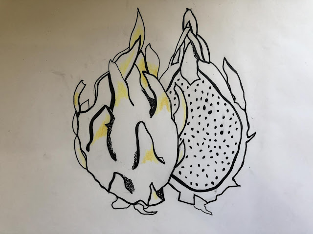
I started by putting down the lightest colour, that happened to be the yellow highlight on the dragon fruit, I tried to be as gentle as possible to create lots of layers of the colour, this makes everything look consistent.

I then added my green, I started with a light green to blend the yellow into, I then added a darker layer of green around the edges of the leaves. This begins to add depth and texture to the fruit and avoids the whole thing looking flat. This is something that happens to me when using coloured pencils, my drawings look quite amateurish because I don't shade properly.

I then put down a light pink this will make it a lot easier when it comes to adding the red. The pink layer underneath can act as the highlight and fill the colour out more. Often it's hard for me not to have a white paper showing underneath, maybe it's my patience or my skill with a pencil, either way, its good to have a layer underneath.

I then added the top layer of red to finish the whole thing off. I'm really happy with how well its all come together, it's worth the extra effort to create the layers as it shapes the whole image and makes it less flat.

I went through the same process with the corn on the cob, I started with a basic ink drawing. I used both the 0.3mm and 0.7mm fineliners to add depth and shadows.

Next, I laid down a layer of yellow. This is my lightest yellow and then I have 2 more orange pencils which will add detail and shadows.

The leaves of the corn on the cob are much like the leaves of the dragon fruit in terms of colour, I really liked how the corn on the cob has folds and more 3-dimensional elements. This not only added a bit more of a challenge with the drawing but also made it less flat and allowed it to have depth. I know I talk about making things less flat a lot, but this is something that's very important to me because so many of my drawings don't flow well and have no life to them. It's something that you can't always put a finger on, it may be because the colour or angle is wrong or in my case, it is the shading.
I then went on to produce a second page of sketching, I wasn't completely satisfied with the level of sketching I had done and thought the ideas weren't fully developed I also had a few more ideas in my mind I wanted to get onto paper. The overall idea to combine high-end marketing with fruit and veg was still prominent. The things I thought of was that the element that links everything together is the text, I understand this is an illustration part of the degree but if I'm going to produce a POS for a supermarket I wanted to create something that could tie into a marketing campaign or at least something I could see actually being hanged or placed in a store.
I thought of using vocab like 'The autumn collection" or "New in this Autumn", this language is often used in fashion as a designer will produce a small collection of clothes, it also can make the fruit and veg seem more fresh and new, I don't know if that is a reach but in my mind it does that because it's talking about 'New'.
I also noted down that the layout is super important as well. I spent quite a long time creating these images so I need to present them in an eye-catching way. I need to think about the rule of thirds and utilising white space.

After sketching I had a solid idea about my direction. The first thing I did next was to find two colour palettes to represent my seasons. I used a website called Adobe Colour to find these palettes. I love the contrast between the two, I think summer has so many bright and fun colours and then autumn is very muted and colder, however, there is still some nice brighter colours.
I then went onto illustrating the decorative element of my POS, for the Autumn POS I wanted to create a branch.

With the tree, I wanted to create something that was not too overcrowded and could act as a background feature. I wanted it to also have lots of character and flow, I didn't want it to be static. I think the thin winding branches achieve that really well.

I then overlapped the colours onto the branch, I achieved this by creating circles of colour overlapping the tree and using the intersect tool to cut out the pieces. Once you add all the pieces together it ties all the colours nicely and has a really autumnal feel.


I then went and created the label for the fruit and veg. I got the idea for the locally sourced banner when I highlighted the word, It just sparked some inspiration.


Here are my two final pieces. I love how both of them have turned out. For the Summer one, I wanted to capture the season but not with loud colours, I stuck with more muted pastel colours as these provide a nice contrast to the bright colours of the dragon fruit. For the decorative element I chose to create a wave, this has so much flow and life and is associated with the sea and the beach. I also enhanced the dragon fruit so the white was pure white before it was the dull white of sketchbook. Overall with this assignment, I did learn a lot through both the colouring and layout side of the assignment. I experimented a lot with different angles and placement for the text as well as with colours. I wanted to create a large contrast with the background colour and the strip underneath the fruit and veg. I attempted to use white as the background as it would give the biggest contrast however it did not look right as I do think white can work but in this case, it strips away the character. For me, a large amount of the process comes with the sketching at the start of the assignment however I also think that there some things that you cannot decide when sketching. For example, I can sketch out an idea and It might look great theoretically however when illustrated it, it just doesn't look quite right. That's why I experiment so much in photoshop as I can just play around with placement and colours quickly. I also leave the room and come back to it a few times just so I can get a new perspective. At one point I had horizontal text, I thought this was a cool experiment but often just because something is out of the box, doesn't mean it works, after a closer inspection I decided to flip it around again.

This assignment stood out to me as its all to do with branding which is an area of design that I'm very interested and excited about. When I read through the brief I had a lot of instant ideas, these were all very generic routes to head down with this Assignment. I could picture in my mind a lot of watercolour drawn pieces of fruit and veg. Now I'm not saying that that cant be a successful approach however I like to be outside of the box more. That can be a generic phrase but I like to push myself to think of something different instead of going with something that is convenient. I think these ideas come to me when I'm brainstorming ideas seem to bounce off each other then occasionally I'll get a whole new idea.
What I first started by doing is highlighting the brief and really thinking about what it is asking of me.

At the bottom of the brief, it said to focus on the food in the image, this is an illustration course after all so I had to lean away from my graphic design instincts and to focus on creating an illustration of the vegetable/fruit. At that point, I knew I wanted to combine classic illustration with modern advertising. This way I could create my illustration whilst still appealing to modern businesses. Supermarkets nowadays tend to use photography to advertise their fruit and veg, its a powerful tool to capture beautifully delicious fruit and veg, camera techniques and editing tools such as Photoshop can be utilised to enhance the look of a piece of fruit or veg.
I then went onto browse google for some references images for myself. What I stumbled across was much of the same. A lot of the art was watercolour, I feel that watercolour gives off the idea of the countryside and fields. It makes art feel very rustic and homey. You would probably not get the same effect with perhaps a vector image or an acrylic drawing. These would make the fruit and veg seem modern and contemporary.
I think to get the most out of this exercise It would be best for me to draw a pretty realistic interpretation of the fruit and veg.

In terms of colour, I found this really cool piece of marketing done for a juice bar which used neon colours with white outlines on a black background. The contrast on this image really just makes it pop and stand out, this is perfect for a shop floor and also instantly made me think of a blackboard which is a works well as classic market stalls use blackboards for marketing.

I then went onto sketching. I wanted to centre my illustrations around a marketing campaign, I feel this is the most effective way to create an illustration with more purpose. I also wanted to make my summer and autumn illustrations feel concise and connected.
The idea I came up with was to combine 3 different illustration styles together in sort of a collage. I would combine some of the common illustration trends with fruit and veg together. Firstly a lot of places use very basic vintage drawings, these offer heritage and character. Secondly the most common I found was watercolour drawings which I mentioned earlier and then modern vector illustrations of fruit and veg, not only do I think this would provide for an original and exciting POS but would also allow me to draw and be creative in different medians. I have definitely kept this idea in my head and want to combine it into my final piece.
Next, I had the idea to tie the season into the marketing I envisioned a pumpkin in a scarf and a strawberry in a swimsuit. This would really drive home the seasonal fruit and veg concept and would be a fun and quirky marketing strategy. Off that idea, I then wanted to build business for the supermarket, marketing is an effective tool for supermarkets to drive business so why drive business for Strawberries when everyone doesn't need convincing on how great strawberries are. Instead I wanted to try something new and in turn, get customers to try something new. I had the idea of taking some of the more obscure and least popular fruit and veg and then remind people how delicious they can be. '"Try something new in your soup" was the strapline for my Autumn illustration, and "Try something new in your smoothie" was for my Summer illustration. Both strap lines build consistency as I mentioned previously. I would then give the fruit and veg a face so they can look smug at a more classic fruit for example strawberry that hasn't been bought.


The second part of my vision was to use modern branding and minimalism inside my illustration. I think this will act as a really nice contrast to my drawing and will work better in a modern supermarket as vintage illustrations tend to be used in rustic farmers markets. I hope that this will add value to fruit and veg subconsciously in customers mind and make them appear as a more high end good. In my opinion, this will work most effectively on exotic fruit and veg which is what I am going to illustrate. Also being modern and sleek are also parts of design I value a lot so this will be reflecting of myself.
A small detail I wanted to include was a fancy large label. This is often something you don't see attached to a piece of fruit or veg and is normally found on clothes or shoes. Firstly this is a perfect tie into the modern minimalist direction I've chosen for my campaign as this type of branding is usually found in clothes and shoe shops. Secondly compared to fruit and veg clothes and shoes are a higher price tag and more valuable, because these big labels are usually associated with them having them attached to fruit and veg will in turn theoretically add that same value to them.
I think through my ideas and development I have created a really strong final Idea, my next step is to complete the illustration. To begin with, I sketched out the dragonfruit, this is the first of my POS illustrations and will represent Summer and Fruit.

The first step was to do a light sketch of the dragon fruit, the fruit as a lot of overlapping elements especially at the top so I had to make sure that I drew clear lines so it would be easier to ink. I focused on getting the proportions of the dragon fruit correct and paying close attention to when some of the leaves folded over on themselves. I have a tendency when sketching to press too hard on the lines so they end up being unnecessarly defined. Not only does this make it hard to correct mistakes but it ruins the paper.

Then using a 0.3mm fineliner I inked the dragon fruit. I tried to avoid doing the same thing I do with the pencils and that is to put too much pressure down and make the lines too thick. However one thing I do is use thicker lines to correct mistakes. Often when using a fineliner sometimes the lines dont go where they need to go and I end up having to use a thicker line to correct that mistake.

I then went over that 0.3mm line with a 0.7mm fineliner. I only went over in places that required shading, This tends to be lines that connect to when another or lines that are inside the drawing. For example the edges of the leaves inside the dragon fruit, I used the 0.7mm fineliner there so that it added the shading that would naturally occur because the leaf casts a shadow on the dragon fruit. This is also where being a left-handed artist really grinds my gears, I often find myself smudging my drawing, I try desperately to avoid it but never the less it always occurs. I try and keep moving the paper so my hand is always resting on a blank piece however as much as that helps it doesn't give me a 100% success rate. What I then have to do is just thicken the line to try and hide the smudge as best as possible.

Next, I went onto colouring, to colour my fruit I chose to use pencils. I think pencils can give such a nice effect and are a lot more subtle and less in your face as say, markers. I also wanted to focus more on detail and shading so I avoided my pastels.
 |
| It is always important to sharpen your pencils |
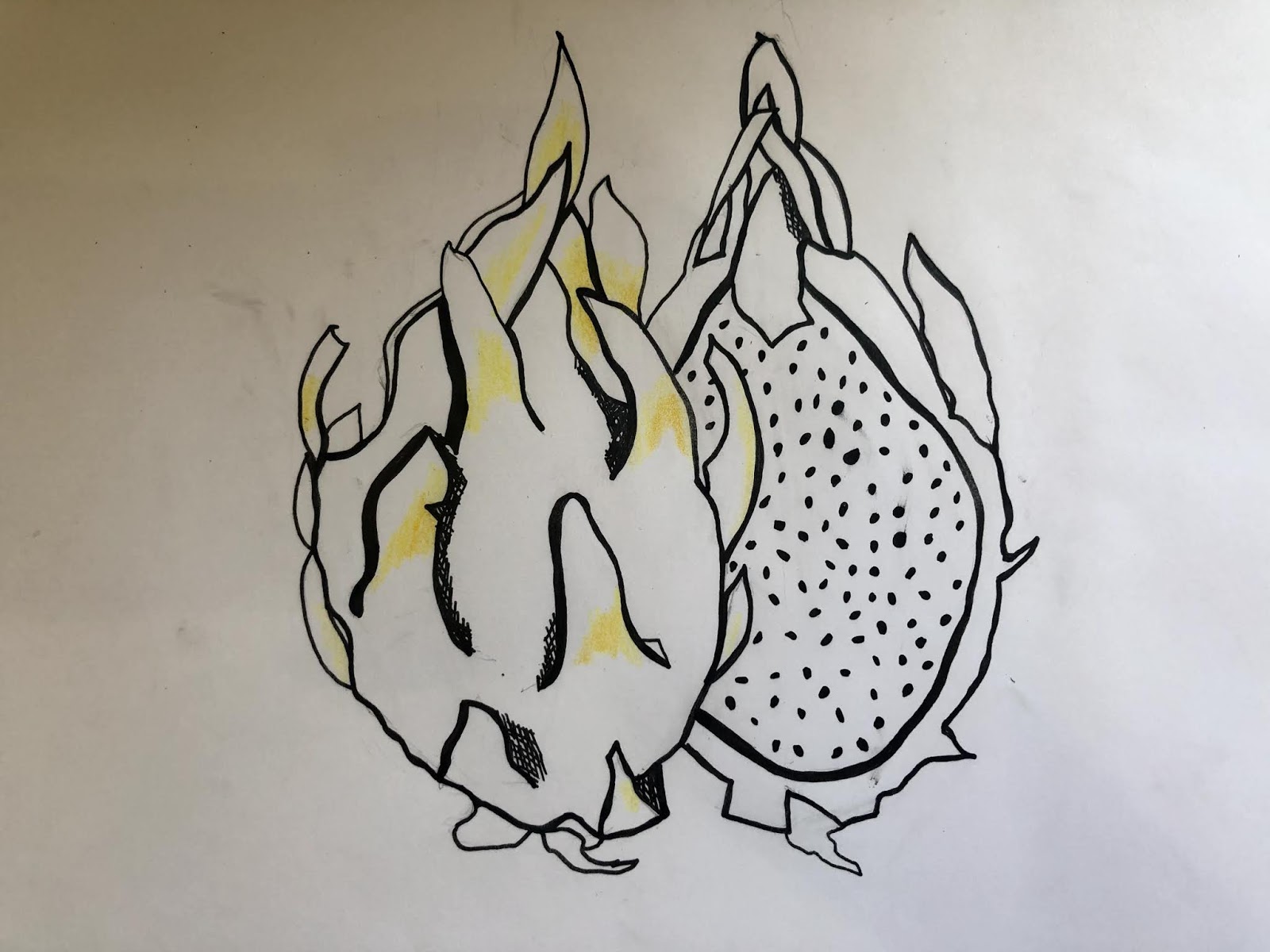
I started by putting down the lightest colour, that happened to be the yellow highlight on the dragon fruit, I tried to be as gentle as possible to create lots of layers of the colour, this makes everything look consistent.

I then added my green, I started with a light green to blend the yellow into, I then added a darker layer of green around the edges of the leaves. This begins to add depth and texture to the fruit and avoids the whole thing looking flat. This is something that happens to me when using coloured pencils, my drawings look quite amateurish because I don't shade properly.

I then put down a light pink this will make it a lot easier when it comes to adding the red. The pink layer underneath can act as the highlight and fill the colour out more. Often it's hard for me not to have a white paper showing underneath, maybe it's my patience or my skill with a pencil, either way, its good to have a layer underneath.

I then added the top layer of red to finish the whole thing off. I'm really happy with how well its all come together, it's worth the extra effort to create the layers as it shapes the whole image and makes it less flat.

I went through the same process with the corn on the cob, I started with a basic ink drawing. I used both the 0.3mm and 0.7mm fineliners to add depth and shadows.

Next, I laid down a layer of yellow. This is my lightest yellow and then I have 2 more orange pencils which will add detail and shadows.

The leaves of the corn on the cob are much like the leaves of the dragon fruit in terms of colour, I really liked how the corn on the cob has folds and more 3-dimensional elements. This not only added a bit more of a challenge with the drawing but also made it less flat and allowed it to have depth. I know I talk about making things less flat a lot, but this is something that's very important to me because so many of my drawings don't flow well and have no life to them. It's something that you can't always put a finger on, it may be because the colour or angle is wrong or in my case, it is the shading.
I then went on to produce a second page of sketching, I wasn't completely satisfied with the level of sketching I had done and thought the ideas weren't fully developed I also had a few more ideas in my mind I wanted to get onto paper. The overall idea to combine high-end marketing with fruit and veg was still prominent. The things I thought of was that the element that links everything together is the text, I understand this is an illustration part of the degree but if I'm going to produce a POS for a supermarket I wanted to create something that could tie into a marketing campaign or at least something I could see actually being hanged or placed in a store.
I thought of using vocab like 'The autumn collection" or "New in this Autumn", this language is often used in fashion as a designer will produce a small collection of clothes, it also can make the fruit and veg seem more fresh and new, I don't know if that is a reach but in my mind it does that because it's talking about 'New'.
I also noted down that the layout is super important as well. I spent quite a long time creating these images so I need to present them in an eye-catching way. I need to think about the rule of thirds and utilising white space.

After sketching I had a solid idea about my direction. The first thing I did next was to find two colour palettes to represent my seasons. I used a website called Adobe Colour to find these palettes. I love the contrast between the two, I think summer has so many bright and fun colours and then autumn is very muted and colder, however, there is still some nice brighter colours.
 |
| Autumn |
 |
| Summer |

With the tree, I wanted to create something that was not too overcrowded and could act as a background feature. I wanted it to also have lots of character and flow, I didn't want it to be static. I think the thin winding branches achieve that really well.

I then overlapped the colours onto the branch, I achieved this by creating circles of colour overlapping the tree and using the intersect tool to cut out the pieces. Once you add all the pieces together it ties all the colours nicely and has a really autumnal feel.


I then went and created the label for the fruit and veg. I got the idea for the locally sourced banner when I highlighted the word, It just sparked some inspiration.


Here are my two final pieces. I love how both of them have turned out. For the Summer one, I wanted to capture the season but not with loud colours, I stuck with more muted pastel colours as these provide a nice contrast to the bright colours of the dragon fruit. For the decorative element I chose to create a wave, this has so much flow and life and is associated with the sea and the beach. I also enhanced the dragon fruit so the white was pure white before it was the dull white of sketchbook. Overall with this assignment, I did learn a lot through both the colouring and layout side of the assignment. I experimented a lot with different angles and placement for the text as well as with colours. I wanted to create a large contrast with the background colour and the strip underneath the fruit and veg. I attempted to use white as the background as it would give the biggest contrast however it did not look right as I do think white can work but in this case, it strips away the character. For me, a large amount of the process comes with the sketching at the start of the assignment however I also think that there some things that you cannot decide when sketching. For example, I can sketch out an idea and It might look great theoretically however when illustrated it, it just doesn't look quite right. That's why I experiment so much in photoshop as I can just play around with placement and colours quickly. I also leave the room and come back to it a few times just so I can get a new perspective. At one point I had horizontal text, I thought this was a cool experiment but often just because something is out of the box, doesn't mean it works, after a closer inspection I decided to flip it around again.


Comments
Post a Comment