Unit 5 Research Points
Project: Magazines and Books
Handling large amounts of text is an essential problem when designing the inner pages of magazines and books. It is about using visual dynamics to create something interesting and balancing it with the need to make text readable. Typographic hierarchies will give the whole page order, you always have to consider being dynamic and orderly at the same time when creating a layout.
The grid was created by designers to deal with these apparent contradictions, it is designed to accommodate all the visual elements of your particular design. It considers proportion, relationship and measurement. The master page layout is there to fit in all of your designs. There is multiple things to consider when designing your grid for example: how many columns do you require for text and images, the distance between these columns and the space for the margins around the outside and of course the blank space that allows you to read your content that's wound throughout.
The golden section: The ideas behind the grid stretch back to accent Greece, the golden ratio is based on the mathematical proportions of the human body it was used in sculptures, architecture and design. Its an ideal measurement that represents the most harmonious proportions possible. A simpler way of thinking about it is the rule of thirds, if you were to split your page into a 9 sections the intersections of the lines are the main points of attention. Its where the eyes are drawn to initially.


Here is the grid placed over artwork, you can see how the artist has considers these points of interest and also this rule is the reason why artists off centre artwork.
Designing a grid
The first things you need to do when designing anything to do with layout is to create the grid. You start off with the basic page dimension's and decide your margin, consider the margin the space where your fingers go so the text isn't covered up when you hold the magazine or book. You also need to consider the width and amount of columns you're going to use. This will ensure consistency and balance in your designs.
Pages can have multiple columns, depending on your content and how you want your design to look. The gutter width is the space between the columns. Interestingly having two columns gives you the same amount of space as a single column but it means that the text is much more readable as the eye doesn't have to travel as far back along the line to the start. Three columns is more common in newspapers and journals, having two columns and often make your text feel very disjointed. Images can run over two columns but should fit within the grid created by the columns.
Borders, Margins and gutters
When dealing with layout the space between things is important. Like I mentioned earlier this margin is used as the space to put your thumbs, the inner margin needs to be a little wider as it needs to account for the binding process.
As paper becomes less expensive and fashions have changed more 'white space' is incorporated into the design of pages. If you compare modern and old newspapers you'll notice this. When space is at a premium this is common practice, having more columns can also make the page appear neater.
Editorial design
Editorial design requires the ability to work with substantial amounts of text, creating typographic hierarchies, this helps people navigate and read the text. A sound use of grids, layouts and visual dynamics are vital to help guide the eye. A magazine spread often runs over several pages, the first page you will often see containing large images and bold header text, sometimes it will have part of the articles but it will only be a small amount.
Project: Publicity and Marketing
A graphic design task that is very common in today's society and media focused environment is creating publicity. Designers will need to create consistent and flexible material over different formats. These include but not limited too, posters, leaflets and adverts. Marketing suggests a more commercial approach, this is usually selling products or advertising a specific event. A designer will draw on work already completed by a PR team, so the designer isn't deciding on how they are going to promote a product but they're there rather to come up with a 'creative solution' to their problem.
Typography hierarchy is important here to get your points across and attract your audience. First as a designer you need to decide what is the most important information and what is secondary information that the audience will need after they're interested in the 'product'. 'What' and 'When' might be priorities when designing a poster to promote an event. What the event is and what its about will initially catch the attention of and pulls your audience in, when is very relevant to an event and is crucial to the audience if they can make it or not, and then where is last because its only relevant to people who are actually going to come. While Publicity is about getting information across in eye catching way, marketing is often more emotive and has a purpose of selling us ideas and objects through more subtle means.
Research Point
The purpose of this research point was to research posters that I'm interest me. I picked a selection of interesting posters from topics that interest me and just design choices.
MOVIE POSTERS


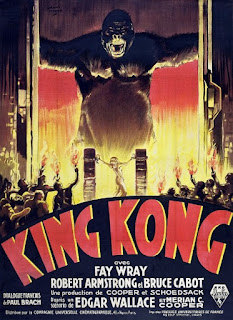
There is a lot of focus with movie posters to fit every member of the cast into one image, and although massive A list names sell movies, I do respect designers to take a different approach to movie posters. This ensures their design stands apart from the 'samey' posters of modern blockbusters. Inception however does feature each member of the but does so in a creative way. Baby driver also does this but I love the art style, it has such a cool aesthetic and I love the composition it feels very intense with a big focus on SPEED. 300 is another incredibly creative movie poster, Gerard Butler isn't centre stage and the designer has chosen to take the films very unique style and capture that alongside the incredibly iconic source material into a very effective poster. Dunkirk manages to capture the solom feel of the poster its full of destruction and very emotive by having one solider overlooking it all.
MUSIC/FESTIVAL POSTERS


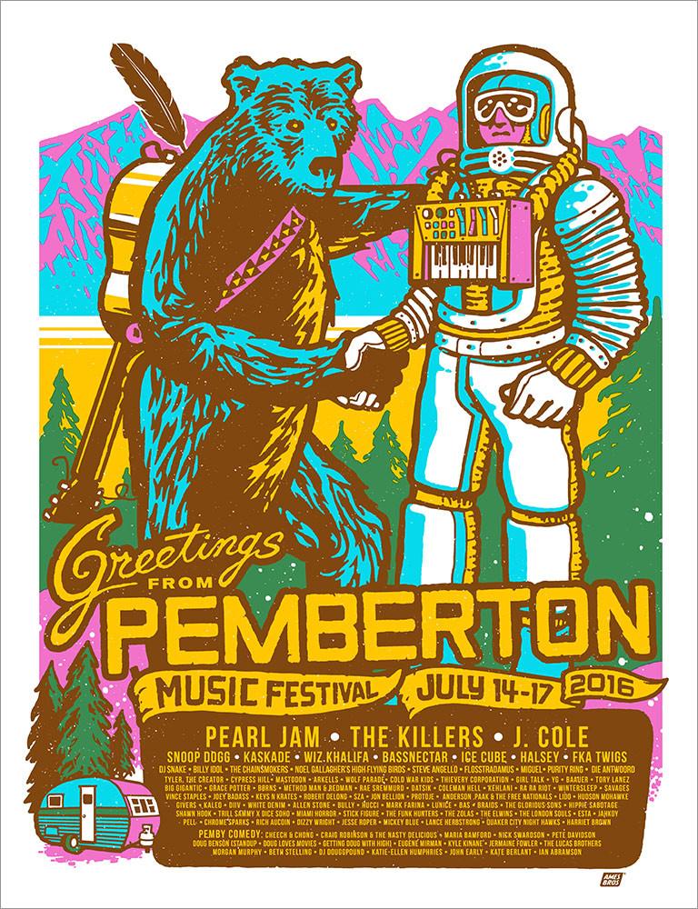
Ive chosen a very diverse set of music/festival posters, music posters, especially for EDM and Hip Hop, have to be modern and on trend, unless they're designed to be unique and push boundaries like the music. Even then they need to be designed with the same basic principles in mind. I love how clean and modern they look, especially the summer ones, they have such a massive focus on colour and freshness. I also appreciate festivals with a focus on illustration, they re always on theme such as the Tiki illustration and the wacky Pemberton festival.
VINTAGE MOVIE POSTERS


One thing a like to always look back on is vintage movie posters, its so interesting to go back to a time before tools like photoshop and illustrator and even high quality photography. These tools meant that posters had to be hand drawn and almost always relied on illustrations. These are inspiring for me especially as I'm trying to branch out into pastels and other medians. Its also interesting to look at hand drawn typography and how artists had to capture the themes of the film whether it be a time or setting within a title.
Project: Branding
Within organisations branding is a key element of an organisations publicity and marketing. Often an organisation will have a house style which sometimes unconsciously will contain a brand colour or colour scheme and possibly a typeface. Other additional elements may include always using a lower case typeface or using black and white illustrations.
Logos: The logo is an integral part of a brand's identity. Logos are quite often difficult to design as they created as a result of solving hard problems such as:
- The client wants something original and special and trying to breakdown those concepts and describe them to you is difficult. Often it might seem like the client doesn't speak the same language as you, but its important to be able to translate what they're after and go above and beyond to meet their requirements.
- There are so many different formats the logo will be used in, it has to be able to be used on a business card, large on the side of a van, on letterheads, t-shirts, the list goes on but these are just a few. It also needs to be able to be reproduced well in black and white.
- The design needs to be as simple and clear as possible, as well as original


Comments
Post a Comment