Exercise: Poster and Flyer
For this exercise I was asked to design an A3 poster and accompanying flyer for a singing course called 'Singout'. It was centred around hierarchy of information and how to work with a specific brief that has large boundaries. The company has very little money and wants to work in black and white.
My initial thought was, how do I make this work? , what can I do to solve this problem. I wanted to find a theme first before thinking about layout, I began sketching out some possible ideas.


Development:
Now I moved onto to developing my ideas, the first idea I chose to develop on my computer was the Phantom of the Opera version.

Next was time to move onto the A6 flyer now I wasn't too sure if I had have varying information on the poster and the flyer or if both had to display the same. So I went with having them contain the same information.


Next I moved onto developing the more elegant designs which I wanted to feature this rose illustration I drew. I photographed my sketch book and uploaded it into illustrator.

From then I used the pen tool to bring the rose to life, I feel like its a really unique and interesting illustration and because it is minimalistic it does have a sophisticated vibe to it, it looks less like a clip-art rose and more upmarket.


These were the two pages for my A6 flyer, I decided that I would change the oriantation of the page to landscape just to be differant see how it would effect my ability to layout. I feel like with a landscape page there was to be a frame to it so that the information which is usually in the middle is the main focus, I chose to use the roses and this frame and It meant that the text displayed in the middle felt more natural and the viewers eyes are directed towards it. For the first page with the title, I made some of the rose petals go over the text, just so it all felt more cohesive and the elements on the page intereacted with each other.
I then went onto develop another one of my ideas, this was one at the bottom of my sketchbook which I felt could look quite cool, its not as practical as the others and wouldn't be able to be photocopied which Is why I didnt pick it. The idea was to have a musical note cut out of the A3 poster so you could see the background and the information around it. I thought this would be quite quirky and the element would definitely draw people in to read more about it.

I actually really liked this final piece and it grew on my a lot more, I know it wouldnt be something they as a company would be able to afford, but the uniqueness of it is interesting. I tried to recreate a more vintage feel with this poster, I used a pastely yellow for the paper and a big bold text which is quite similar to that on vintage movie posters.
Lastly the final idea I devloped was combining two elements from previously designed posters.


Overall I feel like this exercise has been successful, ive found what I feel to be a creative way of meeting the requirments of the brief and producing interesting and well layed out posters. I think ive explored differant variations and styles and definitly devloped my sketching further than I normally would by creating polished versions of most of the sketches instead of just leaving it as little icons. I wouldve liked to have used my pastels like I did on the last exercise, but with the limited color palette I think that it wasnt appropriate and wouldnt have worked.
My initial thought was, how do I make this work? , what can I do to solve this problem. I wanted to find a theme first before thinking about layout, I began sketching out some possible ideas.

These were my initial sketches, my first ideas had all the information on the front of a sing sheet, so it wasn't just a plain poster. I always try and think outside the box with these exercise and I thought that was a quite unique way of displaying the information. It also gave the poster some depth and avoided it seeming flat. I then went a bit further and had the idea of a stage, I was going to draw an audience in pastel, but overall thought this idea wasn't great because of how busy it would be.
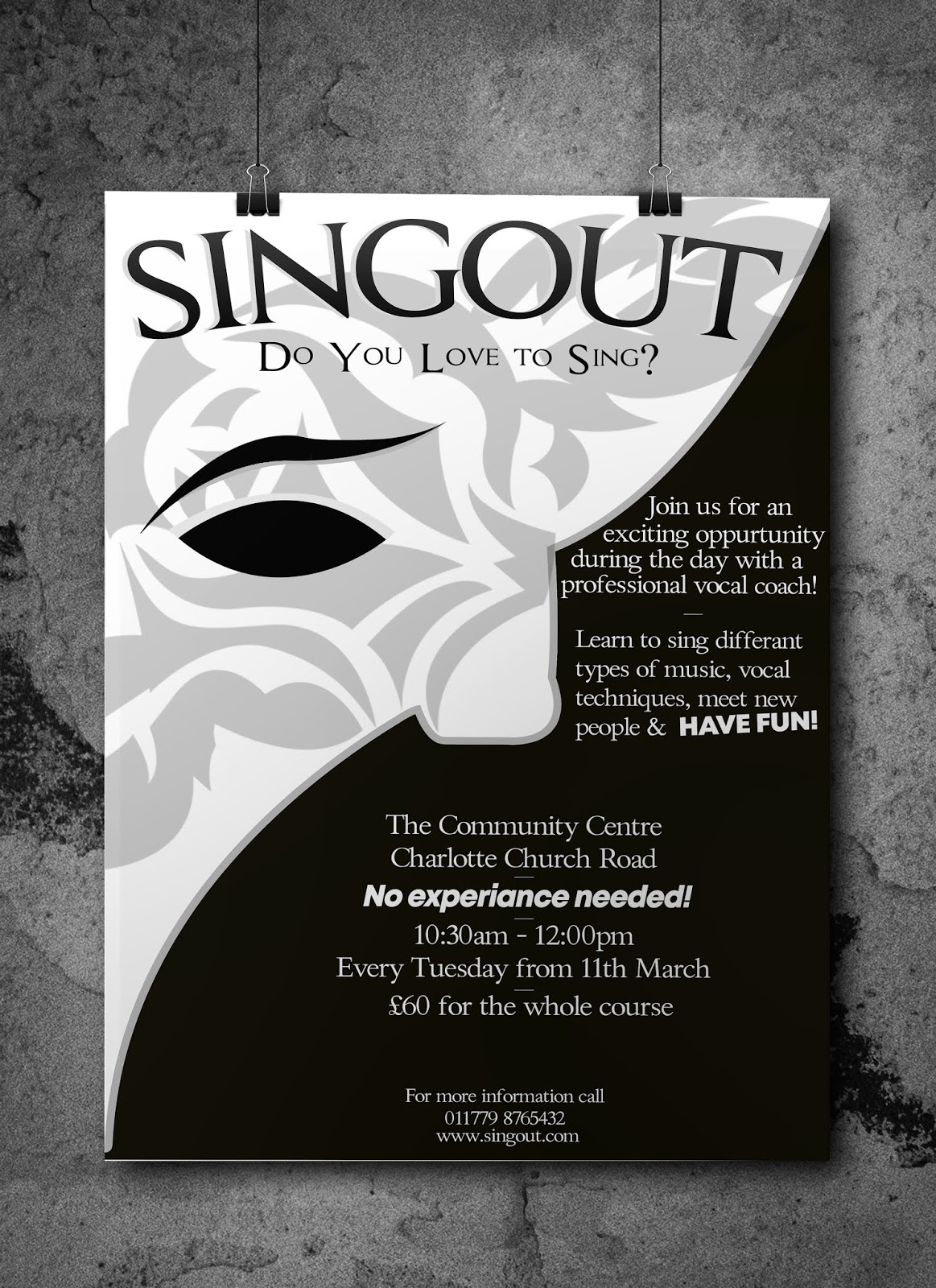
My favourite idea out of all of the sketches was the Phantom of the Opera theme. From the beginning of sketching I always wanted to have a link between the flyer and the poster and tried to implement themes that would accommodate this and allow me to translate the theme in too differant formats which would look consistant together. The Phantom of the Opera is also on theme as its an 'opera' so all to do with singing. The mask is also white which plays right into the brief of a the company wanting the poster black and white, this would give me an opportunity to invert the colours for each side of the A6 flyer so one side the mask is white, and the other side its black.
I played around whilst sketching with how I was going to layout the text, I didn't want to have them in basic paragraphs and wanted to, where I can, have the text interact and follow and illustrations. I used the pen tool on photoshop to create a path and then have the text sit on it. There was also a big focus on the word 'Singout' I wanted this to have a bold presence and almost act like a title for the poster and then I used 'Do you love to sing?' as a bit of a strap line. I took a lot of inspiration from the vintage movie posters I discussed earlier.

The next page of sketching I took a different approach, I wanted them to feel more classy with illustrations of roses. The roses was another phantom of the opera theme and I thought went quite well with the premise of the poster. I then built on my idea of the phantom of the opera mask and overlayed the rose on top of it to make it look classier. I had an idea to incorporate sound waves from a recording studio and also because this is a course I wanted to do something themed around learning, so my two ideas where the graduation hats flying in the air with roses and musical notes and a teachers desk with a blackboard and then the blackboard has all the information about the course on.

Next I had too decide on the hierarchy of information, I wanted to create the best and most logical order possible for someone to read the information in. I learnt how to structure this better when reading through the information on the previous pages of this unit. Obviously the title goes first, its big and bold and quite possibly might be the thing that initially draws in the person. I then followed that with an enticing question, its holding the viewers attention, this will straight off the bat separate people who love to sing and people who don't. I then followed that with information about the course that way people know exactly what the whole course is all about and what you can achieve by doing it. Then if they're still reading I then put the location in, I feel like this is the next most important piece of information as it will determine if its too far away, then was the timing that was the next piece of info they would need and lastly price and contact information. I feel like there could be some potential movement with each bit but I this was the most logical to me.
Development:
Now I moved onto to developing my ideas, the first idea I chose to develop on my computer was the Phantom of the Opera version.

This was what I came up with, overall I like the outcome, I feel like its a well balanced poster and I make use of the space, it has a very interesting premise to it which in my opinion is executed well. I really like the font I chose for the title of the poster, it's not too serious and is quite close to the font used in the phantom of the opera musical. I love as well how the capital letters are noticeably bigger than the lowercase letters and makes it look less plain and simple and gives it something different which adds to the appeal. Ive also made the text follow the mask as a path which again allows to the text to have a more fluid presence on the page.
 |
| Mockup |
Next was time to move onto the A6 flyer now I wasn't too sure if I had have varying information on the poster and the flyer or if both had to display the same. So I went with having them contain the same information.

I wanted to take the exact theme of the poster and then produce a double sided flyer that was inverted on each side, I began to experiment in photoshop with layout of the text and decided that because I only just filled the poster with the same amount of info, splitting that across two sides would mean that there would be too much white/black space around the mask. So I came up with an idea, taking inspiration from the graduation hats and roses falling thrown in the sky I created a small rose illustration and made a pattern out of it. I then inverted the colours on each to give me this.


Next I moved onto developing the more elegant designs which I wanted to feature this rose illustration I drew. I photographed my sketch book and uploaded it into illustrator.

From then I used the pen tool to bring the rose to life, I feel like its a really unique and interesting illustration and because it is minimalistic it does have a sophisticated vibe to it, it looks less like a clip-art rose and more upmarket.

This was the poster I came up with, as you can see below the rose just didn't look right the way I had initially sketched it out, It was one of those things that seemed like it would work on paper and then when I create a version of it on my computer it just didn't. So I decided to enlarge it and have it as a background pattern, I also changed the color of it was it was a light grey, this meant I could sit the text on top of it, I also adjusted the perspective of the 'do you love to sing' just to adjust the flow and added some musical notes to avoid having too much blank space.
 |


These were the two pages for my A6 flyer, I decided that I would change the oriantation of the page to landscape just to be differant see how it would effect my ability to layout. I feel like with a landscape page there was to be a frame to it so that the information which is usually in the middle is the main focus, I chose to use the roses and this frame and It meant that the text displayed in the middle felt more natural and the viewers eyes are directed towards it. For the first page with the title, I made some of the rose petals go over the text, just so it all felt more cohesive and the elements on the page intereacted with each other.
 |
| Final Leaflet mockup |
 |
| Final Poster Mockup |

I actually really liked this final piece and it grew on my a lot more, I know it wouldnt be something they as a company would be able to afford, but the uniqueness of it is interesting. I tried to recreate a more vintage feel with this poster, I used a pastely yellow for the paper and a big bold text which is quite similar to that on vintage movie posters.
Lastly the final idea I devloped was combining two elements from previously designed posters.
I think this is my favorite of the bunch, its an extra litle bit of detail which adds a lot to the mask, it makes look more luxurious and slightly resembles the clockwork men from Dr Who.

Overall I feel like this exercise has been successful, ive found what I feel to be a creative way of meeting the requirments of the brief and producing interesting and well layed out posters. I think ive explored differant variations and styles and definitly devloped my sketching further than I normally would by creating polished versions of most of the sketches instead of just leaving it as little icons. I wouldve liked to have used my pastels like I did on the last exercise, but with the limited color palette I think that it wasnt appropriate and wouldnt have worked.


Comments
Post a Comment