Exercise: Giving Information
For this exercise its all about information graphics and how they are specificily designed so that the information on them is easily identifiable and legible. Ive always loved the complexity of timetables and city maps. For example the london underground map is so complex but yet people can deciper the information because its displayed in an organized way. Also I also feel that a lot of the reason why things are readable is down to the choice of color, fonts and layout. These 3 things amongst others feed into it being a successful infographic.
I feel like the stand out feature for this infographic is the color choices, for starters the designer has chosen pastel colors which are innocent and gentle like the topic itself (babies). The second decision I think is the focus on illustrations, flat 2d illustrations like the ones here are almost considered icons. I think this works in this type of infographic because of how its meant to be asthetically inviting, people want to read this and consume the information. Illustrations make it exciting and also makes the whole thing easier to read because small chunks of text are split up with these images.
This is a bus timetable for London, theres 3 buses on one image, the infographic also displays the routes of all three buses aswell as the times. This is something that someone who uses the bus will need to look at. Its more of a necessity so the design focus shifts to making all the information readable and less of a focus of it looking asthetically pleasing. However it still needs to look good but theres an obvious differance between graphic 1 and 2. For example theres a severe lack of color between the two and less of a focus on creating inviting images.
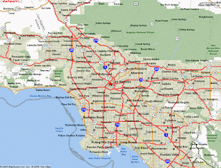
City maps are more interesting to look at, this is a satalite view of LA. The whole idea of the city map is to give a detailed breakdown of things like, roads, highways, streets and names of places. This has to achieve a lot of things, firstly information from a city map must be easily obtainable. The consumer must be able to deciper distance and direction from the map. For example if someone wanted to know the route from 1 place to another, a city map needs to give them clear direction, whether it be what road to take or which is the quickest route. This is where extra design choices are made. This city map comes with a key to differentiate the main roads with side roads and streets.
For my own infographic I decided to create a breakdown of my bedroom, I sketched out a rough idea of what my room looked like, my intial idea was to take boring architecure layouts and give them a more modern twist. From looking back at the research I did I now had a good idea on how to achieve this.
This is what I came up with, the three main factors I wanted to use to create this infographic was, color, font and layout. The colors are taken directly from the London undergroud map, I was really keen to use the underground maps to use design choices from them. What is by its nature a really busy map is made simplier and easier to read. In theory it should give the same feel to mine, now obviously there isnt as much information in my graphic because my room isnt that busy. I couldve labelled more of the specific items in my list.
This was the second inforgraphic I created which was a breakdown of my wardrobe, I illustrated the shirts and tshirts using the sketches I photographed.


Comments
Post a Comment