Playing with words
For this task it asked me to create typographic representations that 'present both the word and a suggestion of its meaning'.
The task does say to print out text on A4 paper and cut out the words but I decided to go one step further and create unique representations of each word individually. This was to push my creativity further.
I began by sketching out ideas for each individual word in my sketchbook, for some I had multiple ideas.


I then went onto develop the ideas further, some I was decided to draw out on paper and ink, and others I created digitally for reasons I will explain.
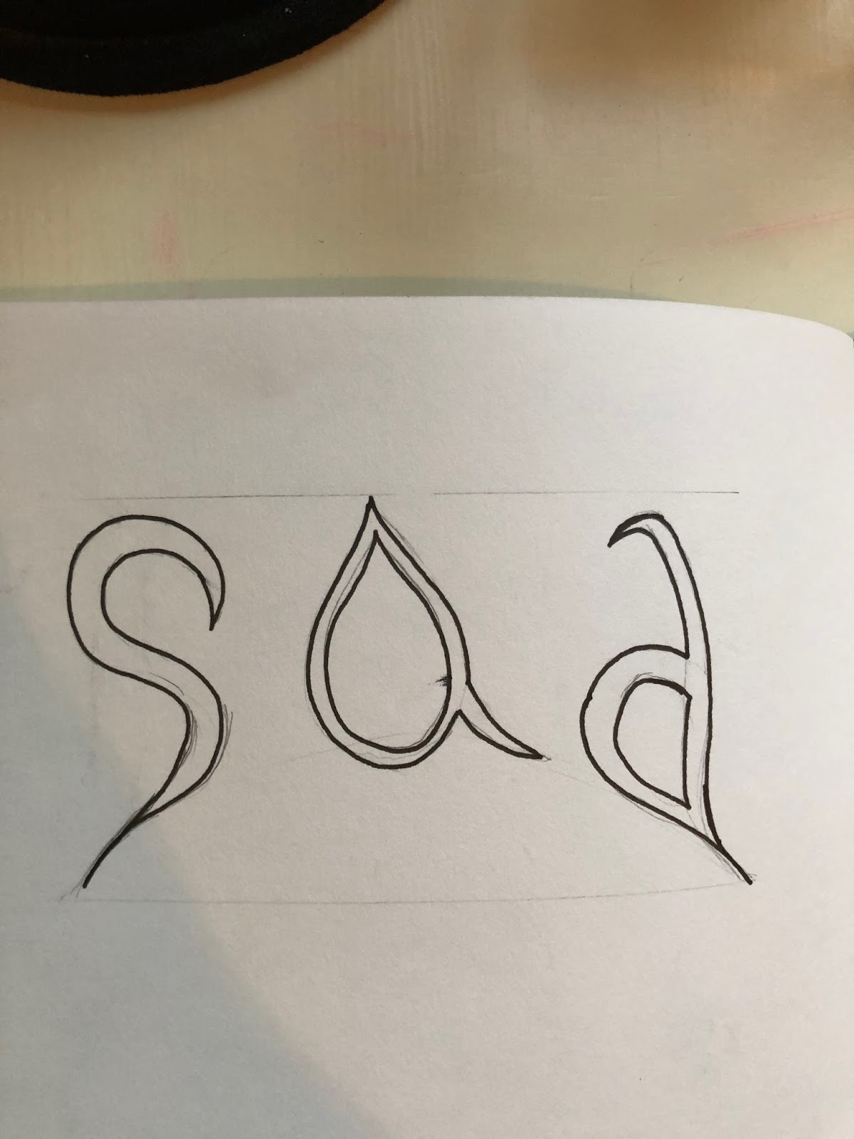
The a is meant to be a tear drop and the whole word is on a curve to represent a frown.

I wanted to create something in the negative space, so I chose a font where I could place the pharmacy sign. Becuase a pharmacy keeps us safe.

I had to research what Sardonic meant but it means cynical and empty, so the idea behind this is that it looked empty inside.
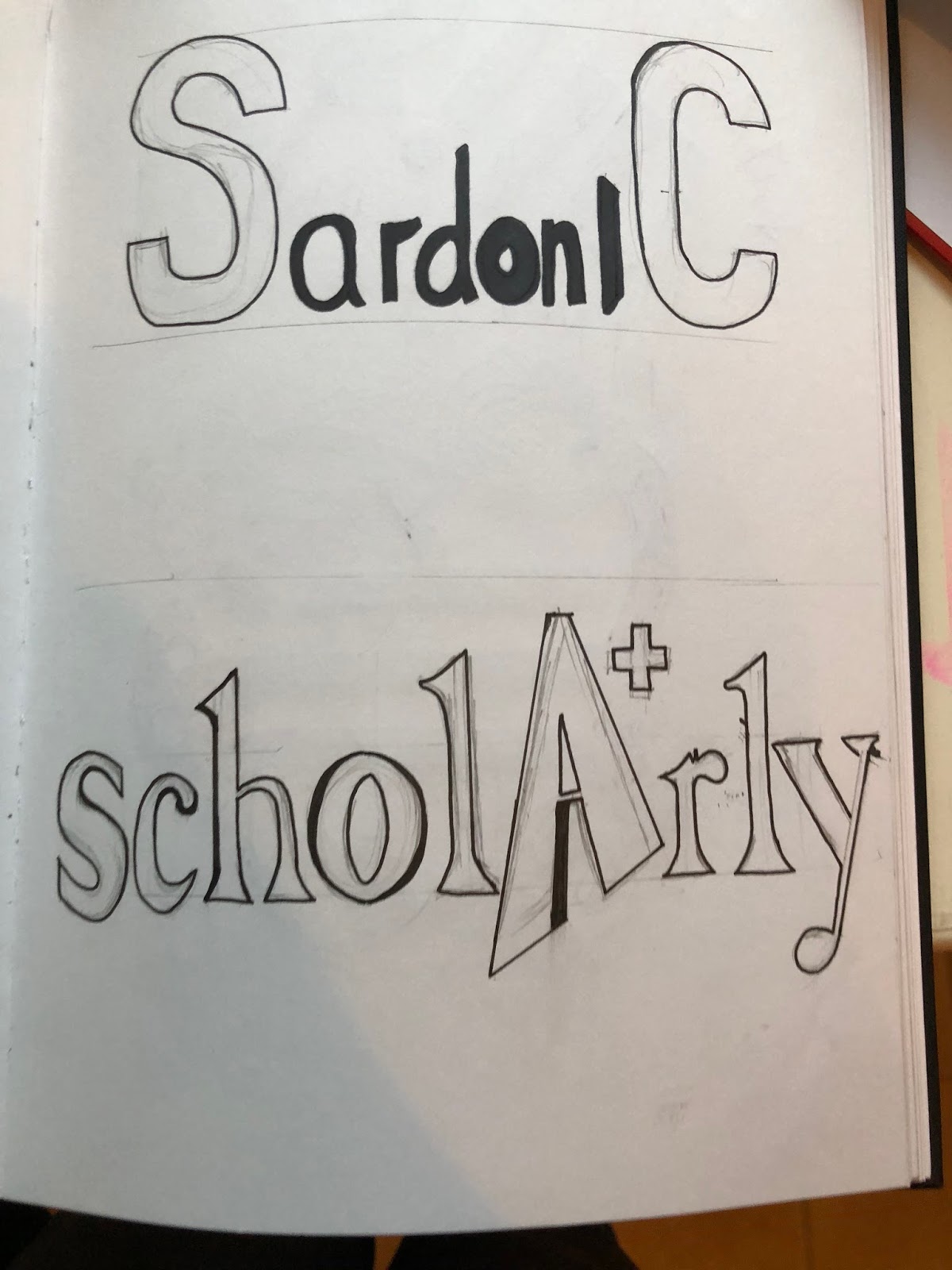
The A is a A+ to represent grades, Ive also used a serif font as its the most sophisticated.

For silly I created two versions, one where the actual font was fun and silly and the other where I create a motif of cartoons that fitted around it.


My idea behind this was that it had flare and the curves represnted almost flames.

This one is pretty self explanatory, the text gets smaller, Ive tried to keep it at the same angle so the text itself is uniform and consistent.

My Idea behind Shy was that It was supposed to be hiding in a corner, my dad didnt really get it, but with some explination he found it quite effective.

For this one I wanted to draw it in a noir font, as those films always seem to be quite dark and spooky which is what came to mind when I thought of Shadow, Ive also chosen to literally make the DOW the shadow of SHA

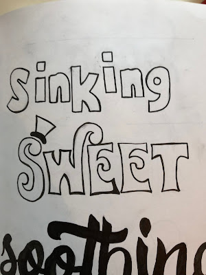
I wanted to draw the word as if it was placed on quick sand and the letters were slowly sinking down.
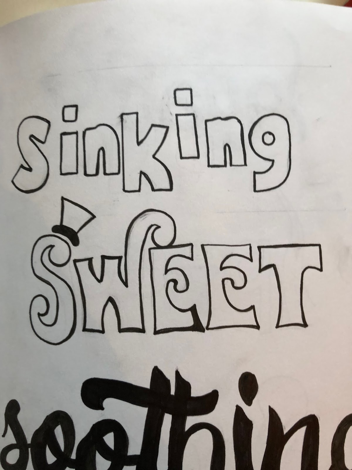
Ive copied the stlye of Willy Wonka for this one, as its the first thing that came to mind and Is centered around sweets and chocolate.

For Soothing I wanted to find a gentle font, something with flowing curves and didnt have any sharp edges.

The S in squat is shaped like someones back as if they were squatting

For speed I took inspiration from the F1 logo, the S is a winding road.

My idea for sodden was that it would look like I inflated the word with water. However inside photoshop I overlayed a wet dog hair texture as that is the most damp and sodden thing I could think of and also messed around with the free transform tool to make the word look inflated like a water baloon.

Some of the most sophisticated things I could think of was a bow tie and a Serif Font

This is supposed to resemble a Supreme Tshirt which is a popular street wear brand. You could say the brand has lots of swagger.


Comments
Post a Comment