Assignment 2: Reflection
Its been quite a while since my previous post but I've been busy working on my 2nd Assignment, this was one I was very excited for. The Assignment is called Thinking of you and requires me to create a range of greetings cards that are worthy of a card but isn't currently catered for. An issue that I thought of early was how I was going to represent the event because my cover had to represent my message visually. After I decided I was going to theme my cards around music, I had to decide the sentiment, originally It was going to be "You've listened to (Insert artist here) for the first time", however, the market for this type of card would be incredibly limited as unless you broadcast to everyone the first time you listen to Kanye no one is really going to know, let alone by you a card! The second idea was to have greetings cards for people that have been to a concert saying, "Hope you Enjoyed (Insert artist here)" This is the direction I decided to take originally.
Afte it was onto the design, the question was, how was I going to represent this sentiment visually? For example, Christmas, Easter and birthdays all have elements you would be able to put on cards, such as Santa and presents, however, this doesn't really have anything to use. The only thing would be the artist themselves. So I decided to illustrate caricatures of my artists. Picking artists were the next challenge, I wanted to incorporate my tastes in music alongside artists that can be illustrated quite easily. These include artists with stand out features such as hair and teeth as well as easily recognizable faces, this is because this would be the first time I would've done something like this, so I was already in uncharted territory. The first artist I chose to go with was Kanye. This guy is my all time favorite artist and he is also easily illustratable. My sketchbook was the first place I went to, I got up some reference images on google and begin to mess around with different ways of drawing Kanye, a lot of them didn't go to plan, so be warned some of these look nothing like Kanye himself.


 Now, this was the sketching I completed for my Kanye card, but because I wanted to the cards to be consistent the design would be incorporated in all 3. I wanted to add the phrase "Hope you enjoy" Into the card somewhere as this was the main sentiment. I first made it the biggest part of the card with thick bold text spreading out the width of the card. This is such a cool looking technique and works really well at creating stand out text. As you can see from my sketches I experimented with pinwheels, and redacting part of a block of text to read "Hope you enjoy". I also liked the idea of having a simple card by having the text small and dead center on the page, accompanied by my character this works really well in greetings cards as it keeps it contained and less busy. Also, the brain picks up elements of design that aren't centered, there's a reason why so many designers center parts of their work because it looks symmetrical.


I began sketching out several different ideas, I started with the Weeknd, as I said I wanted to incorporate elements of each of his albums. The first thing I did was get up reference images up on my monitor of each album cover. I then went on to pick parts out I liked. These ranged from the placement and size of text to actual visuals. For example on Beauty Behind the Madness Abel's face is all cracked up like an old photo, I loved this effect and found a tutorial on how to achieve this in photoshop. I also created the 3 diamonds from The Trilogy and made my text big and bold to replicate Starboy.
I completed this step 2 more times for the remaining covers, what I found was that it's harder than I first expected, for starters many of the parts you
 pick out won't work together visually and others just aren't practical as they make the cover look too busy such as the gold border in A College Dropout. Once I decided on my final ideas for each sketch I started producing them in Photoshop, I created a large square file with the size 4961 x 4961. This gave me a perfect platform to begin piecing together my covers. I started by sourcing the images for each cover. For example, in the Stoney cover, I used a piece of barbed wire from the cover of rockstar, I gathered these individual images I wasn't creating myself into a folder so I could access them later on. I also had the individual png files of each of my faces.
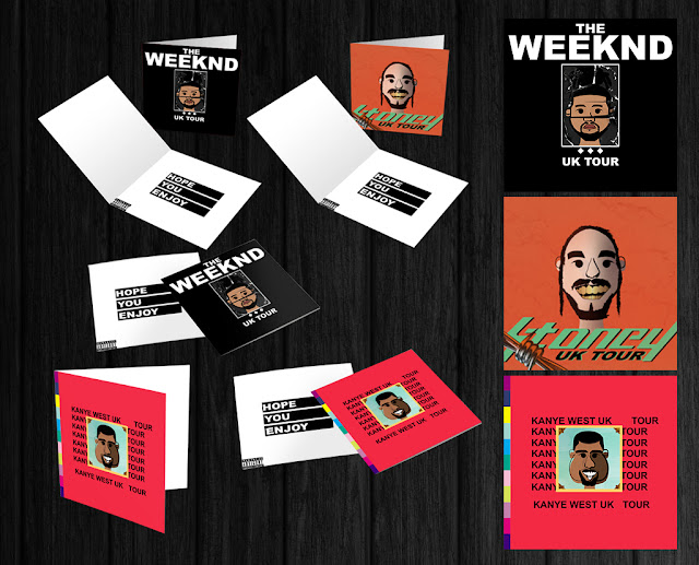
 After completing each of the 3 vinyl covers I decided to mock up an envelope design, this would be the packaging that the customer would receive their tickets in. I decided to go with the most fitting choice and that would be a vinyl envelope.


Afte it was onto the design, the question was, how was I going to represent this sentiment visually? For example, Christmas, Easter and birthdays all have elements you would be able to put on cards, such as Santa and presents, however, this doesn't really have anything to use. The only thing would be the artist themselves. So I decided to illustrate caricatures of my artists. Picking artists were the next challenge, I wanted to incorporate my tastes in music alongside artists that can be illustrated quite easily. These include artists with stand out features such as hair and teeth as well as easily recognizable faces, this is because this would be the first time I would've done something like this, so I was already in uncharted territory. The first artist I chose to go with was Kanye. This guy is my all time favorite artist and he is also easily illustratable. My sketchbook was the first place I went to, I got up some reference images on google and begin to mess around with different ways of drawing Kanye, a lot of them didn't go to plan, so be warned some of these look nothing like Kanye himself.

Now this is what I came up with whilst sketching Kanye out, it was early on when I captured Kanye's features, I knew one of the main features I wanted to get right was his smile, the old Kanye always used to have a big cheesy grin on his face, another stand out feature is his cheeks, often artists represent him by having the big chubby cheeks, which is quite true to form. I then sketched my final idea out and inked it. I used a fine liner, to begin with, then thickened up the main lines with a black marker. Kanye was quite an easy silhouette to work with especially in terms of hair, his straight cut meant that it could be drawn with a marker quite easily without having to add much detail. I also really liked the idea of having very simple eyes, because this was supposed to be a cartoon and also I was thinking about having to illustrate him digitally afterward. Having simple, yet quite quirky features such as the comma eyes and the little ears not only allowed me to illustrate him easier but also gave me unique features I could use in my other cartoons to make them uniform and to see them as part of a set.
The next step was to get him into illustrator for inking and coloring, now because I had put in the work to create fully inked sketch it meant that I could follow this better once it was inside illustrator. I used to pen tool to illustrate half of his face and the reflect the shape and tidy it up to make it symmetrical.

This was the final product, I really enjoyed illustrating Kanye, this was the first time I had illustrated something like this before, A struggle I came across was Kanye being too flat, after doing all the line work when I deselected the sketch image, what I was left with was a flat set of black lines, I knew it wasn't going to look perfect but this was quite bad, I realised it was because there was no varied line thickness, this is something that is quite easy to achieve and adds so much life to the picture as it adds depth, now it has to be done right, the thickness of the line is used as a shadow, usually I thicken lines that connect together, for example where the ear connects to the cheek, I also used them to add shadow, I picked the right side of the face: the cheeks, ear, and nose were all thickened. Now I need to add colour, I added a base skin tone #ad704e underneath the black ink layer, I then shaded the right side of his face with #5a3a22, I shaped this shadow layer so that it flowed nicely from the eyebrow and nose, I didn't want a harsh line separating the base skin tone and then shaded area, the black lines acted as a transition between the two so it was easier on the eye. I added some other bits of shading around the forehead and under Kanye's eye to give the image depth. For style purposes, I lowered the color layer down so that it didn't fit perfectly but instead was offset, this was just an experiment but I believe it turned out quite nicely. Lastly, I added some texture to his beard with a hair brush I downloaded.
Now Kanye was complete I moved on to drawing out my other artists, I did the same process, a few little sketches so I had an idea of how the face was going to look, I then proceeded to upload those into illustrator and follow this same process to create Post Malone and the Weekend. This is the final 3 set of illustrations.
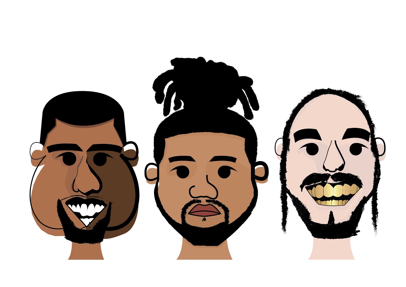
I'm really happy with how each of them came out, they all like uniform and match up with each other which was important to me. I've gathered a lot of opinions from friends as well as the great people on the OCA forum the overall consensus was positive surrounding my illustrations. My next task was to sketch out the main body of the card, I wanted my design to accompany my illustrations without making them just the main feature and a bit of text. I had to give the card the same flare so it didn't look mundane.


This was the design I chose to develop, its a mixture of a lot of the sketches I completed, I found a really nice script font for the word "Kanye". I found this really nice effect of creating two duplicate text layers with contrasting colors, I then shifted them to the right to give a shadow-like effect. I don't really know how to describe it but it's a text effect I love and defiantly will be using it a lot. I also wrote Kanye in all lowercase, there are 2 reasons for this, the first is that lower case texts gives the word a less serious feel, I also think it flows nicer and looks cleaner. The second reason Is I preferred the lower case k to the uppercase K as it intruded too much on the other parts of the design. Because I wanted it to stand out I put "HOPE YOU ENJOYED" into black boxes like the redacting sketch I made. This not only balanced out the image but also added a bit of contrast to plain text, it spiced it up a bit so it wasn't mundane. After some feedback from the OCA forum (I use this forum a lot to get feedback from my work), I decided to change my text to "HOPE YOU ENJOY" and then I could include my greetings card with the tickets inside when they are mailed out to the customer. This was the 2nd card I created using this concept.

I used the same concept to create the 2nd card, trying to keep it as close to my first one as possible. I changed up the text a little by using orange instead of blue, this orange wasn't just random though It is used on the album cover of Post's album. Along with the blue being part of one of Kayne's striped polo shirt.
Now, this is where it got interesting, after some feedback from Clive on the OCA forum, he suggested changing the page orientation. The original card shape was supposed to step away from standard card sizes, and with my landscape based design it flowed better on a landscape card and I preferred it opening bottom to top instead of left to right. He suggested changing it to a square card to act as a vinyl cover. I loved this idea so much and got sketching. I decided I was going to take elements from these artists existing album covers and turn them into a hybrid cover.

I began sketching out several different ideas, I started with the Weeknd, as I said I wanted to incorporate elements of each of his albums. The first thing I did was get up reference images up on my monitor of each album cover. I then went on to pick parts out I liked. These ranged from the placement and size of text to actual visuals. For example on Beauty Behind the Madness Abel's face is all cracked up like an old photo, I loved this effect and found a tutorial on how to achieve this in photoshop. I also created the 3 diamonds from The Trilogy and made my text big and bold to replicate Starboy.
I completed this step 2 more times for the remaining covers, what I found was that it's harder than I first expected, for starters many of the parts you

 After completing each of the 3 vinyl covers I decided to mock up an envelope design, this would be the packaging that the customer would receive their tickets in. I decided to go with the most fitting choice and that would be a vinyl envelope.


Comments
Post a Comment