Fruit and Vegetable Exercise
I have no idea why this exercise took so long to complete I just wasn't happy with every incarnation I produced. I started with sketching out simple ideas for the POS, I also browsed Pinterest for ideas surrounding fruit and veg. I found a beautiful collection of fruit and veg illustrations and loved the style. However, I've mentioned previously that I don't want to focus too heavily on the illustration on these projects and where possible avoid it and use photography instead. So I saved those photos into a separate folder. I recommend everyone does this. Whilst browsing sites such as Behance and Pinterest just save everything you like, you may not use it for your current project, but you end up creating a library. So I get to work designing, I had always envisioned from the start that text was going to feature very heavily in my POS displays and the imagery was going to be second to the text.
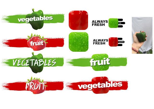


As you can see in all of these design the text is the main part to the POS, firstly I thought it would be quite cool and interesting to make the vegetables and fruit these rounded squares, they almost look like app icons. I really like the look of these as it took the body of pieces of fruit and vegetable and turned it into a universal shape taking away part of what made it a piece of fruit or veg. This meant that the colour and texture had to represent the vegetable and fruit instead. Which was a challenge for me as I had to decide which part of the fruit and veg greatly represented the food? Also from a practical point of view, transforming them into a uniform shape also made them incredibly universal, if this was for an actual store they could expand and do this for other pieces of fruit and veg or even other food groups. However, after some more experimenting, I decided to put that idea to one side and begin designing something different, in the hope that I could return to that design, later on, to extend or add something to it. So I started creating the strip of paint that would act as a backdrop. I downloaded a brush pack for photoshop to give it an authentic paint strip look. This not only acted as a backdrop for my images but also lifted it off a white background and give it some flare and made the composition more exciting. I also found a free brush font called Game of Brush (If anyone is interested in using it). I thought this worked really well with the brush stroke, however, In my eyes, this was too much of the same look ( hand-drawn painting feel) and also Clive from the forum pointed out something interesting, that the font wasn't current enough, obviously its important for a designer to use elements in their design work that they like regardless of other opinions, however when designing something for a client, one thing to consider is if the style is current and relevant. Its come to my attention that this brush font isn't. It was a trend, and whilst personally I appreciate it, In terms of longevity it would have to be replaced. That's why I changed the font to what Is now my favourite font, Ariel Black. This font is so versatile and timeless. This simple sans serif font will never go out of trend. Also to add some contrast I used a duplicate in a darker colour to go underneath which almost acts as a shadow.
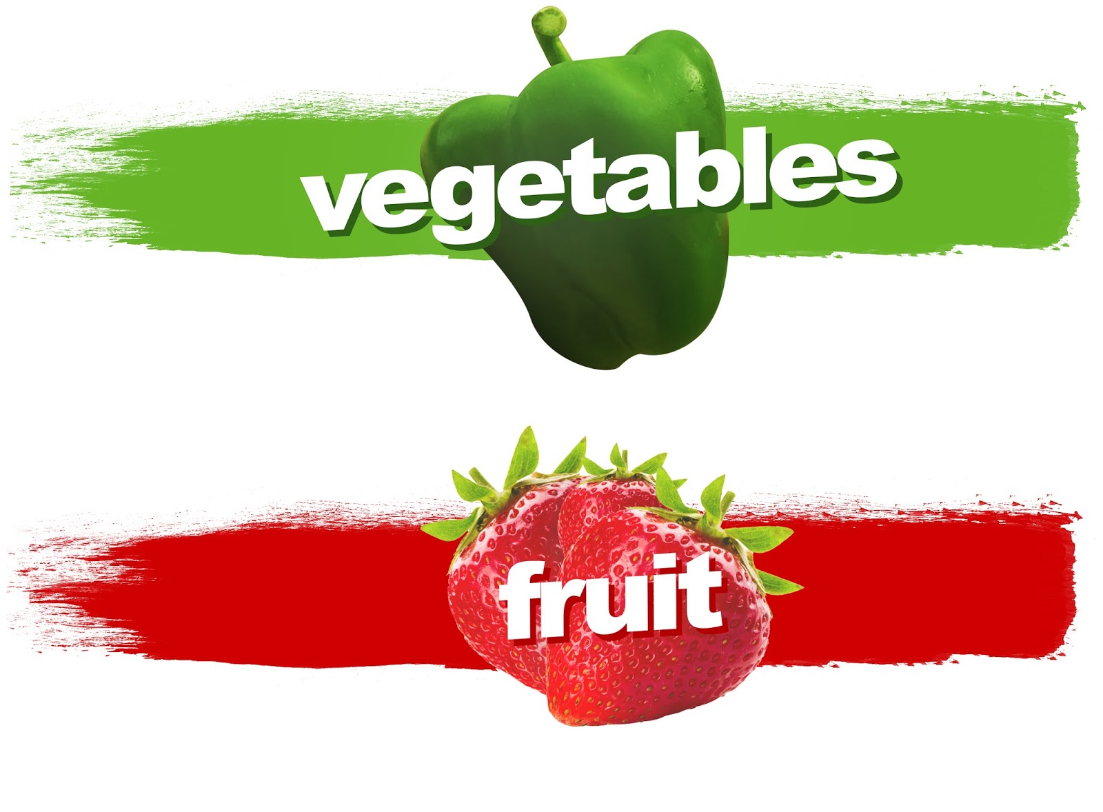
Whilst I was creating these pieces, I had the brief in the back of my mind. I had to make the images visible from the street through a window. I also had to touch up my food images to ensure that they look appetizing and not mouldy or discoloured.
This is the final design I went with, I made sure the text was bold and striking and used an easy to read font (Ariel Black). I also touched up the fruit and veg to enhance its appearance and make them look delicious. I created all of these images in photoshop, but if these were going to print, I would use illustrator to vectorise the text and paint stroke. I also took both of these photos with my phone camera in natural lighting. Now I could've used my DSLR but for ease, I used my phone as its connected to Icloud and syncs with my Macbook.


Comments
Post a Comment